Showing posts with label sketching. Show all posts

Sunday, January 28, 2018

30 Minute Sketching - Keep it Simiple

30 Minute Art - Sketching
By Alwyn Crawshaw


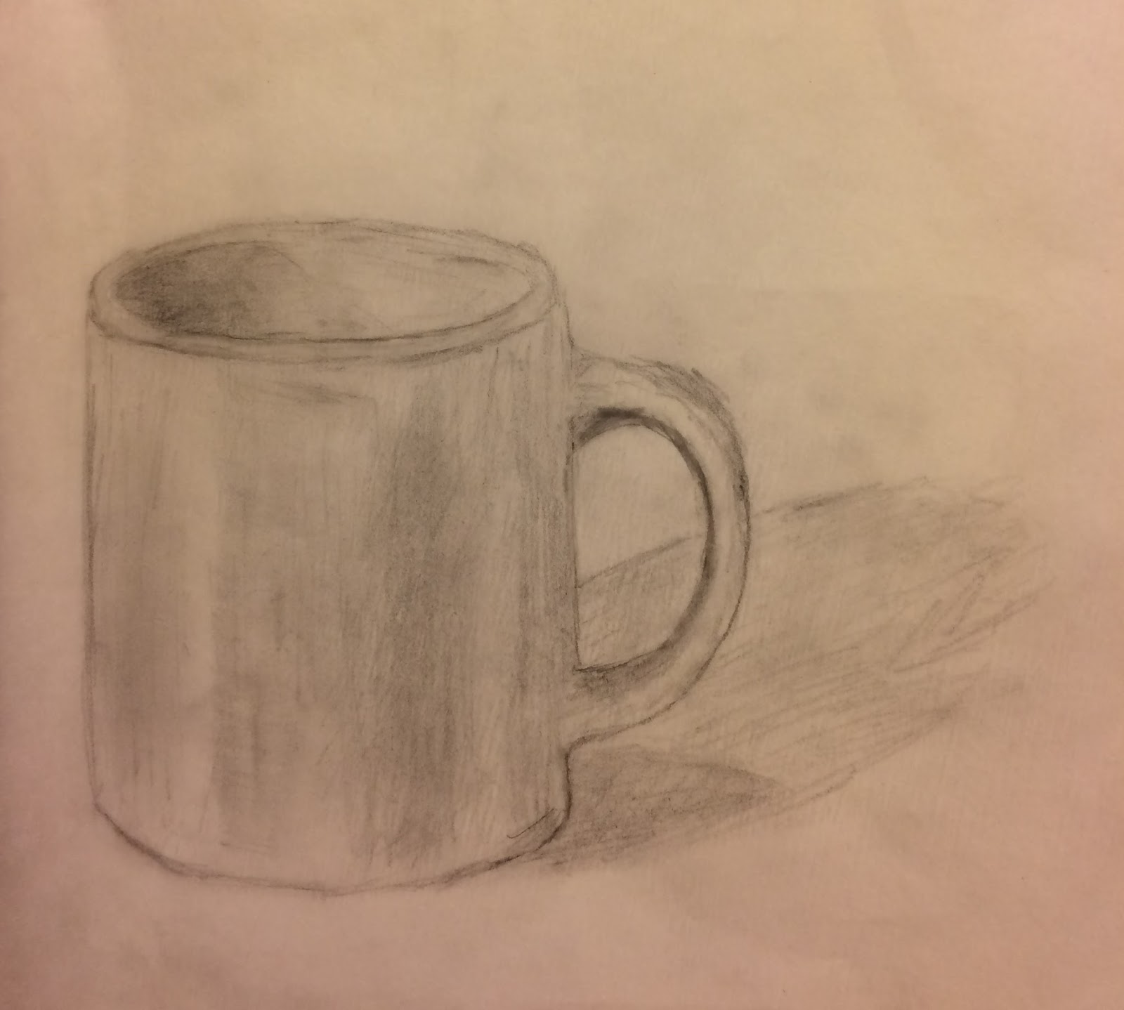
We've finally made it my final blog of this book, in this meeting I will look into Crawshaw's final major tip on sketching keeping it simple and quick. How he puts it into words is that "a non-painter sees everything, but an artist sees only what is important to his or her sketch" (Crawshaw 41). Using a few methods can bring up the habit of simplifying things more. For the most effective way would be too use only a long hold, as making it difficult to draw would drive you to putting in too much detail or putting any irrelevant details (Crawshaw 42). 

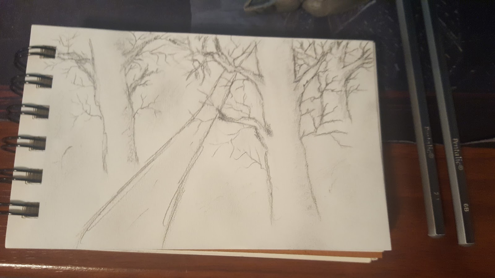
For this final drawing I will finally time myself to the 30 minute limit, it will be a simple small forest with a dirt road. I used a 2B pencil too put in detail and make out the drawing, while buffering it with a 6B pencil to make quick and quality shading. Coming out was this final product.


Alwyn Crawshaw's 30 Minute Art book, has probably been the most helpful tool I've gotten to improve my capabilities in drawing. To finally end off I want to know what has been the most helpful system of knowledge whether it is a book, website, or video?

30 Minute Sketching - Still life

30 Minute Art - Sketching
By Alwyn Crawshaw


Further through the book, Crawshaw recommends making quick still-life drawings in order to practice/improving your ability to make fast sketches (Crawshaw 32). He also says to be "bold and positive" avoiding outlines as it will lower the quality of your sketch making it look "weak and lifeless," (Crawshaw 32).

This is my first still life sketch I've made and it came out well, took me a little over half an hour so it wasn't truly 30 minute art but it's probably the fastest I've ever made a drawing in.

The still life was actually pretty fun and relaxing to make, I'll definitely be making more from now on mostly of flowers they are very beautiful to sketch. Now being further in I'd like to know what you've been sketching, specifically into still life's and how have you been enjoying it?

30 Minute Sketching - Using different grades effectively

30 Minute Art - Sketching
By Alwyn Crawshaw


Straight after positioning Crawshaw goes into the different gradients of pencils specifically the B grade pencils. Beginning with a 2B pencil "For this sketch I used a 2B pencil, which allowed me to draw some detail in the trees" (Crawshaw 18). In his second sketch he used a 3B pencil describing it to be much faster at making the sketch but at the cost of the quality of the sketch due to the use of a softer lead (Crawshaw 19). Replicating a drawing for the last time using a 6B pencil, "Because the 6B has a very soft lead it is not easy to draw detail, but it is easy to shade in areas quickly to create a simplified image" (Crawshaw 18). Instead of replicating a drawing three times, I opted to utilize all three of the pencil grades to effectively make a single sketch.

With the 3B pencil I was able to very effectively make a base structure with branches in slight detail.


Leading up with a 2B pencil I drew in some twigs, also fixing up the base structure to be much more detailed.

Finalizing the drawing I put some light shading on with a 6B pencil drawing in the light from the left.


I was extremely satisfied with this drawing up to now I believe this is the most improvement I have seen. Finding the difference in gradience has been probably the biggest eye opener to towards all types of drawing, as everything seems so much better using each separate pencil to improve my sketches. Coming this far I'd like to know how much you have learned not only from my posts but also in your own time from different books?

30 Minute Sketching - Styles/Techniques

30 Minute Art - Sketching
By Alwyn Crawshaw

Next I would like to talk about the different positions/styles that are available to sketch, and how to use them effectively. In order to use your pencil most effectively you're going to need to learn at least the three basic positions (Crawshaw 16). Crawshaw goes on to short detail of the three positions Short hold, Long hold, and Flat. In addition an eraser can help in the drawing process of sketching, as when shading an eraser can help lighten areas when needed (Crawshaw 16).

Testing out the techniques I started with a long hold using a 3B pencil to set out a base structure, base of the tree and the branches


After using a short hold I put a more definitive structure to the sketch, and making the twigs of the tree done with a 2B pencil.

To finish the drawing using a 6B flat hold pencil I added some shading.


I remember the times I used to sketch before this since then I would use a mechanical pencil and really only use a close short hold even for the shading. But in the last week I can say my skills in drawing have very much improved. Ending another I'd like to ask how much you've improved in skills and what has changed since then?

Sunday, January 21, 2018

30 Minute Sketching - The Starter Kit

30 Minute Art - Sketching
By Alwyn Crawshaw

To start Crawshaw introduces how sketching is done which is not to really be a perfect or presentable piece. How he puts it "There is no pressure on you, because you are not painting for an exhibition or to please your friends or family; you are sketching for your own enjoyment" (Crawshaw 7). They can be done just wandering about outside finding a place to sit down for awhile and just get to drawing, or in my case a fabricated scenery or even a single object. This style of drawing is actually one of the best ways of making art, as many artist have produced beautiful pieces topping even their exhibition art. For now I would like to just be able to improve my capabilities of drawing going more into depth/perspective and scenic drawings, maybe I'll try to make a masterpiece of my own another time.

Now comes equipment, before this book I would generally make random sketches with a 0.7 mm. lead pencil. The recommended sketching kit would be a 2B, 3B, and 6B pencil and optionally a Kneaded Eraser, and a small sketchpad and really works but I had used Strathmore while Crawshaw had used Daler-Rowney sketchpads.


I tested out the pencils by making a few lines, small patches of shading and small sketches of trees to test between the three. 


Starting with the 2B pencil (middle drawing), it felt like it was very precise I could get the smaller details down but it was much harder to shade it very quickly or well due to it being lighter. Then the 3B pencil (bottom right drawing) felt like an in-between of the 2B and 6B it could get details down but not as well as the 2B and it could shade decently but worse than the 6B could. Finally the 6B pencil (bottom left drawing) had me make a more general sketch I did try to put some detail into the sketch, but the shading is probably the best way to use the 6B.

That concludes my first blog, before you leave I want to hear your opinion on supplies do you think that it is necessary to have good supplies to improve your capabilities of drawing?

Monday, December 11, 2017

Two-Point Eye-Level Perspective Drawing

                                     Two-Point Eye-Level Perspective Drawing by: Olivia Nguyen 
The Château de Vaux-le-Vicomte  is a historic baroque in Paris. In my newest drawing however it is a two-point eye-level perspective drawing. When you draw you can express how you feel without writing the details. The paintbrush is your friend and the words are the paint. This sketch was by far the most time consuming, it was not however as tricky as last posts, but still i needed help. I am using Understanding Perspective by Stephanie Bower as a reference in my follow along drawing. In this drawing I used my Pang water color eight set, Bic pencil, Pentel aquabrush, and notebook paper. This time I decided against pen. I thought it might give the drawing a more realistic work, because obviously in real life there are no lines just shadows and contrast. 

When doing two-point perspective sketches Bower says "Try to place the closest vertical edge off-center to create a composition with better movement. Placing that corner in the middle of your drawing splits the image in half and leads the viewer's eye out of your sketch" (Bower 53). When I was sketching I placed my vertical edge off just a little bit. It made a huge difference. The drawing had much better composition and flow. The viewers eye now was directed off page. It has a cool effect where everything seems slightly taller and gives a worms eye perspective. Many great and everyday artists use this technique in urban sketches, such as Eduardo Bajzek, Paul Wang, and Josiah Hanchett.

The reason why most sketches aren't straight on are because of the effect you get when it is angled to the side. When a drawing is not straight forward you can usually see more than one side of a building. This gives a more natural and raw way of looking at the drawing for the viewer. Bower explains that extending converging lines on each side will take the vanishing point separate ways. Both of the ways on the eye-level of the sketcher or viewer (Bower 52). In these types of drawings the vanishing point will be off the page. This will make things much harder as you might have to guess where many of the lines will lead. This can lead you to inaccuracy and make your whole drawing off. 

I will leave you with a question, do you believe the risk of inaccuracy is worth the better drawing in the end if you leave the vanishing point off the page? Also what is your favorite drawing of mine so far?

Thursday, January 26, 2017

Face Characteristics

        Hello everyone, and welcome to my last blog! As my final blog, I decided to do something more challenging - the face. Since I felt that my skills are still not strong enough to draw an entire face, I decided to just focus on a part of the face instead.
        Because everyone's faces are alike yet so different, it's hard to make a portrait actually look like your model. I decided to focus on the nose and lips. Garcia, in her book shows that a nose isn't as easy to draw as it seems, "Since you're apt to focus on eyes and mouths more often than on noses, take a really careful look at the feature before you start drawing" (Garcia 114). It may be hard, but it's a start. 

The nose and lips I drew
        What I drew above is not anyone's in particular, it's just what I drew to try and make it look somewhat like a real nose and lips. Again, I used the advice of Claire Watson Garcia to help me draw this. In her book she advises to start at the bridge of the nose, then go on to the fleshy end, to the base, and finally to the nostrils of the nose (Garcia 115). You can't see it in my end drawing, but I started as she said, at the bridge of the nose. First, I made a line, but once I had the whole nose drawn out, I went back and adjusted the bridge of the nose, making it more gradual, like it's connected. With the lips, I made sure to use what I learned about shadows from my third blog. I also added creases along the lips, to make it more realistic, similarly like I did with the drawing of my hand. At the corners of the mouth, I also added the little creases, making the appearance of the mouth being tied in a bit.
        Overall, this IRP blog project has definitely helped me become a better artist, from sketching, to shading, to the face. Through this I think I also have found myself a new hobby, because I noticed that I may have a slight talent. As I have seen evidently through this project, practice helps you get better, by a lot!


        How did you enjoy this IRP project? Do you also feel that you've gotten better through even just these 5 posts?


Garcia, Claire Watson. Drawing for the Absolute and Utter Beginner. New York,
     Watson-Guptill Publications, 2003. 

Learn Drawing Quickly: Combining Different Drawing Styles

Welcome to my final blog post. In this blog post I am combing all the previous skills I have learned throughout this experience. I will be drawing gestures with an angle and tone added to it. When drawing, you want to add different kinds of techniques. If you don’t, your drawing will look very bland. I decided to draw a coffee pot, a coffee bean bag and a bottle of pills. Something you may see in your everyday life.
 For the coffee pot I added tone to where the shadows would naturally hit. And for the coffee bean bag I made it a gestural drawing, not adding much detail. But enough so the person looking at the drawing can tell what it is there for. When drawing these, you have to have an open mind (Finmark 71). In Learn Drawing Quickly the author says “Once combining your drawings, you are able to get a look into the real world. You should be free when drawing and have fun with it. It makes or breaks the natural feel of the drawing” (Finmark 71). Looking back, I can definitely see that I improved. And I’m proud of it!

Are there any skills you have improved in or want to improve in? If so, what are they?

Tuesday, January 24, 2017

Learn Drawing Quickly: Gestural Drawing

Welcome back to my fourth blog post! In this post I will be talking about gestural drawing which is a type of drawing you speed through, like a doodle (Finmark 68). This drawing has been the easiest for me so far because it requires the least amount of work than the other drawings I have done. This drawing is mainly used if you have a lot going on in your drawing, such as people walking in the background. You don’t have time to add every single detail to an individual person so sometimes artists use gestural drawing. In Learn Drawing Quickly, the author says “Gestural drawing is a way of speeding up as you can’t focus on details, so it’s useful for making rough sketches of groups of people” (Finmark 68).

One example of how you can sketch a gestural drawing


Gestural drawings are very simple as you can see. You just draw the outline of the object you want in your drawing, without adding much detail and you’re already there. 

What do you guys think? Have you ever used gestural drawings but never realized it until now?

Thursday, January 19, 2017

Dimension and Omitting Perfectionism

        Hi everyone, welcome back to my blog! On today's blog, I will be focusing on creating dimension and also omitting perfectionism, as seen in the title.
        I've never drawn a hand to make it look realistic, so this was a first. I'm not going to lie, though, I was excited to try it out, to see how far my skills and practice could take me. Luckily for me, Claire Watson Garcia left step-by-step instructions as a guide to how to draw a hand"
        "1. Trace your nondrawing hand, palm down, fingers together or spread.
             Draw the folds in your knuckles.
         2. Put in shadow shapes if they are present, squinting to see them.
         3. Use contour drawing to fill in specific nail shapes.
         4. Fill in an overall skin value and use your finger to smooth out the surface.
             Use your directional lines to map out rows of knuckles in a slight semicircle" (Garcia 69).
        I followed the given directions, and I'm glad I did. I never thought about tracing your hand, and only then adding the designated details to it, so it would turn out proportional and the right size. 
The finished drawing of my hand

        This is actually my hand, which means of course that I drew it not from a drawing. I was surprised with my end result. I didn't think it would look nearly as realistic as it does. Though it does look pretty good, it's not perfect. Sometimes that may annoy me, but Garcia teaches otherwise. No artist is perfect, and all the imperfections we make are unique to us, which makes every artist different, in their own way. Generally we are scared of it being imperfect because we are afraid of being vulnerable, of being ourselves in our art, and we need to get over that fear, because it's who we are (Garcia 68). The way that she worded made me think hard, because really, she's right. There's no point in trying so hard to make it perfect, because we'll never get it perfect anyways. Even though my drawing isn't perfect, I think it's decent; decent enough to be able to tell that it is a hand. That's what matters most.


Do you agree that perfectionism deprives us of our unique selves being shown through our art?


Garcia, Claire Watson. Drawing for the Absolute and Utter Beginner. New York,
     Watson-Guptill Publications, 2003.


Monday, January 16, 2017

Learn Drawing Quickly: Angle of View

For my third blog post, the next step to learn how to draw was to understand shapes and how they change to the human eye depending on the point you’re looking at them from. The example I decided to draw was the cup. The cup is an easier example to show the way it changes when looked at. When viewed from the top, it’s circular. But when looked at from a lower level the circle becomes an oval. In the book Lean Drawing Quickly, the author says that this gives your shape more of a realistic feel (Finmark 30).


In Learn Drawing Quickly the author says, “Basic shapes appear to change depending upon the angle from which you look at them- this gives your drawing the realistic appearance” (Finmark 30). So I drew some examples of what it would look like staring at a cup from different perspectives. This is my final product, I think I did pretty well, but I can improve and make the drawing look more as if you are looking directly at it.

Do you think drawing shapes as if you were looking at them are crucial to making the drawing look more realistic rather than adding the tone?

Saturday, January 14, 2017

Shading Shadows and Reflected Light


        Hello everyone, and welcome back to my blog! Today, I will be looking at the shadows of a drawing, and how to draw them correctly in order to make the drawing look as realistic as possible. 
        Whenever I draw something, of course I always add shadows, because the drawing wouldn't look like anything without them. But the harder part is to know how to add shadows. Where to add shadows at all, where should I make it darker, or lighter? How do I make a shadow transition smoothly as light usually would in real life, so it would look real? I decided to make a blogpost on this, to help me get better at this specific skill.
        Before I started though, of course I read what the author had to say, and what advice I should take to know what to go off of. As I was reading, a key piece stood out to me, "Soften the transition between shadow and overall value by using less pressure on your pencil. Put in the cast shadow, incorporating horizontal strokes to help the shadow lie flat. Show reflected light in the shadow, either by erasing shadow values or darkening around them" (Garcia 63).
My finished drawing of a cup
        Instead of drawing off a real live model, this time, I wanted to try to draw from an already drawn picture. I thought it turned out pretty good, much better than I expected. I also changed the kind of paper I used, taking the advice of my peers. This paper is much less rough, and much easier to blur, making my shadows look a lot smoother than before.  Not only did that first piece of advice from the author help me, but also where Garcia talks about how you should use your finger to blur the shadows, and the edges, where needed. Also she states to change direction of you pencil often, with tighter scribblings, to make it easier to smooth it out (Garcia 63). All in all, I thought this drawing is better than my previous ones, and this book answered my questions, and helped me immensely.


        What do you think about my drawing? What could I improve on? Do you agree with the author to change direction of the pencil often to make it easier to smooth out a shadow?


Garcia, Claire Watson. Drawing for the Absolute and Utter Beginner. New York,
     Watson-Guptill Publications, 2003.

Monday, December 26, 2016

3-D Drawing and Sketching

        Hello, and welcome back to my blog! If you've seen my last blog, then you would know that I am blogging about drawing and sketching and my goal at getting better. On today's blog, I will be looking at drawing objects in 3 dimension. Not necessarily with shading, but for now, just simply making it look like whatever I'm drawing.
         If I come to draw something, just something I'm good at, I always add shadows to make it look more realistic. While I am still starting though, the author, Claire Watson Garcia, recommends to choose something to draw that is not too complicated, and instead of drawing every detail and every shadow, instead try to make it 3-D with what you see, omitting the shadows (Garcia 23). Though I still did add a little shading, for the most part, I thought that this drawing, with barely any shading, was one of my best drawings.


The scissors that I was drawing
  
My finished drawing of the scissors
        As you can see, there isn't much shading that I did this time, following the book's directions. I was pretty surprised how realistic it turned out. One thing I noticed though, is that the scissors don't look like they're at the same angle, which they're not supposed to, because I didn't add any of the shadows or anything. Another way that book helped me was how the author wrote, "...we need to draw only what we are able to see, not what we know is there. We know one blade of a scissors exists under the other, but we see only part of that blade - and that's the part to draw" (Garcia 27). When I put it into practice, by only drawing what I saw, I noticed that in order to make something look realistic, you don't need that much shading. Overall, I would say the book helped me with not taking so much time into adding the shadows, but instead drawing what you can and can't see, in order to make it look like what you're drawing.


What do you think? Do you agree with Claire Watson Garcia, or do you think shading and shadows must be present to make a drawing look realistic?


Garcia, Claire Watson. Drawing for the Absolute and Utter Beginner. New York,
     Watson-Guptill Publications, 2003.

Friday, December 23, 2016

Learn Drawing Quickly: Texture With Color

Welcome to my second post! In this post I'm going off of what I have learned from my previous blog post. I've learned how to add texture to my drawings just by using a pencil. But adding in more than one color and making it look somewhat realistic is hard. I decided to use my last drawing; the clove of garlic to test out using texture with colored pencils.


This was my first attempt at using colored pencils to create texture and make the drawing look more realistic as the book says (Finamark 18). In Learn Drawing Quickly the author says, "By marking or smudging with color, you give the appearance of a more realistic object" (Finmark 18). Although it was my first try, it wasn't very bad for someone who hasn't done this kind of thing before.

What do you think? Is there anything I can improve on in making my drawing more realistic when I use color?

Tuesday, November 29, 2016

Learn Drawing Quickly: Texture

For the IRP Quarter 2 project, I wanted to incorporate a new skill into my life. I have done many drawings in the past. Mainly very ground based sketches such as stick figures. Over the years, I began to be less interested in drawing. For one thing, I became discouraged because I'm not the best artist. Second, I didn't have as much time to keep drawing and it wasn't my number one favorite thing to do in the first place so I just disregarded it.

In this quarter, I hope to improve. Not necessarily becoming professional by all means, but just to gain a few new skills and be able to draw more than just stick figures. One specific area I look forward to in this project is seeing my overall development in the artistic field.

In my opinion, I think that art carries a deeper meaning beyond just the portrait itself. What I like about art is that anyone from anywhere can interpret it through their own experiences in life. To add on, I believe art isn't something one can achieve overnight. It is a skill in which it takes time and practice in order to see the progression.

For my first sketch, I drew something really simple. A clove of garlic. I did a scratch like surface to show texture in the drawing, as it says in Learn Drawing Quickly (Finmark 15). Drawing lines over and over again to show that the garlic had more of a feel to it, even if it’s on paper. Learn Drawing Quickly says, “Using pen or pencil, you can make scratchy lines to show a surface, building up to overlapping lines to indicate the darker tones” (Finmark 15).


In any new skill one partakes in, I strongly feel you have to put your all into it. Even if you feel like it isn’t to the best of your abilities. Art aids in the growth of patience and gives you more of an understanding of the world around you, even in the simplest drawings.


Does art make you think beyond just aesthetics?