Showing posts with label Kaur Keerat. Show all posts

Thursday, January 25, 2018

Drawing: Body

            For my last and final blog of drawing, I decided to go with the idea of my first drawing and draw another person. This time I decided to draw the body and not the face. I draw faces all the time, so i took it up a notch and drew a young girl who with our perspective has her back turned to us. The book The Usborne Complete Book of Drawing by Alastair Smith and Judy Tatchell, accompanied and navigated me throughout my process and journey of the piece I drew.
          The first thing I obviously need to draw is the outline of the body. In the book it states, "Begin your drawings of whole figures by marking a sketch of the body, using pencil. Start your sketch by drawing the rough shapes of the main body parts" (smith, Tatchell 10). In the drawing I first started with the basic shape of a head which is not circle but kind of like an oval. As I went along I drew the neck which will eventually be covered up and the the shoulders. The arms that I drew were not straight but they were slightly tilted inward as if she were holding her hands together. At first I drew her main body as a rectangle, lightly with a pencil before I added curves. The book gives very critical advice. Before i drew this piece I tried drawing a body before but it didn't turn out the way I expected because I tried drawing the clothes and everything, I didn't start out with the basics.
         The second and most important thing in my opinion is the stance or pose the body has. The stance of the girl I drew is with her back towards us as i mentioned before. The great tip that the book gave was that when they said, illustrating poses and proportions is exaggerating the drawing of the body. To emphasize the drawing, there can be different styles of clothes such as ones that are elegant  or comfortable (Smith, Tatchell 18). I took the advice from the book and gave a girl a pretty and flowing dress with an intricate design. I drew a dress that was strapless and her hair was down so you couldn't see her whole back. I drew a band around her upper waist and then the design below that.
       All in all I think the drawing turned out superb. This was the first time I drew a person without the face showing and I am glad i took the risk and learned how to draw more. I would like to say that drawing is not always my forte. I only draw good when i'm in the mood to draw and I can't be forced to draw. Over this 3 moth period, I found time when I was in the mood to draw, and drew these pictures with all my effort and focus. Hopefully to your eyes they turned out good.

How would you say this drawing turned out?
Do you like the drawing without the face or would you have preferred it with the face?
If there is anything i can change, fix, and add what would it be?

Smith, Alastair, and Judy Tatchel. The Usborne Complete Book of Drawing. Usborne Pub., 2009.

Friday, January 19, 2018

Drawing: lettering

         I have created many drawings of many different things such as flowers, animals, and human beings, but the side of art I haven't got a chance to explore yet is with words. In all of my drawings I have never added a single word and I know the infamous phrase "pictures speak a thousand words", but adding just 1 word can make the picture speak a thousand and one words. Adding words to a picture or drawing not only enhances the drawing itself, but also gives more depth and meaning to that specific piece of art. Through the tips and techniques from the book The Usborne Complete Book of Drawing by Alastair Smith and Judy Tatchell I have been able to create 2 pieces filled with words that speak to ones heart and a drawings that touches ones soul.
        Sometimes its hard to think about what to write in a drawing but the way I started my drawing was with a heart in the center of the page and then a band going around it with petals and flowers on the outside. The key to this piece was going to be the phrase i was gonna write. In the book, the authors state, "Small letters are just over half as tall as capitals, Small letters sticks and tails extend above and below the guidelines by about the same amount" (Alastair, Tatchell 112). Knowing that smaller letters are smaller than the capital letters is an obvious, but it is still important to show which letters are smaller so they don't all seam big. The Phrase I chose was "Fill Life with Love", it fits into the theme with the heart and the roses but I can also use the tips from the book that fell me about the sticks extending above the guideline and the tails going below the guideline. I wrote in cursive so the only letter that went below the guideline was the smaller letter f.

   I decided to draw 2 drawings for this blog to show that there are many different styles of words that you can incorporate into a piece. The 2nd piece I drew was a little less serious and maybe a little more humorous. In this piece i drew a bee as a picture and then wrote the word happy with an exclamation mark under it. I wanted this piece bring life into someone's eyes so the type of lettering I used was comic lettering. According to the book, this type of lettering is supposed to look like one that has been handwritten, meaning that is could be a little shaky or even a little uneven. And they said we could even use our own handwriting as a starting base (Alastair, Tatchell 118). I used the tip of using my own handwriting as a base to start off my letters. I usually draw most of my letters with like a swoosh in the end such as with an h or a y. So for my lettering in the drawing i decided to go with that technique of mine and even though it didn't come out perfect, it related back to comic lettering since this type of lettering isn't supposed to be so precise and could be shaky or uneven here or there.
      All in all, I would say the letters of both of my pieces came out pretty good. Not at all perfect, but I drew them to the best of my ability and spent my time worthwhile.
     How do you think that my drawings and lettering came out?
     Do you think that adding words to drawings gives more meaning or emphasis?
     If you draw, have you ever added words or will you ever in the future?

Smith, Alastair, and Judy Tatchel. The Usborne Complete Book of Drawing. Usborne Pub., 2009.

Monday, December 25, 2017

Drawing: Cars

         I can draw animals and humans but 1 thing I don't usually draw machines. So this time I tried to draw cars. In the book The Usborne Complete Book of Drawing by Alistair Smith and Judy Tatchell there were many different types of cars you could draw. some of the cars were vintage, cars with different patterns, or crazy cars with expressions. Cars with crazy expressions seemed interesting to draw since I could basically add emotion to my drawing. It really amazes me how you could turn an object that doesn't have emotion into one that does so that is what I went with.
      Since I have never drawn a car before, I needed some tips to get started and the book gave exactly that. The book stated, "A car is roughly made up of a box shape, with four circles near the corners, and a smaller, flatter box on top. By varying the proportions of these shapes, you can create different types of car, from an upright vintage car through to a sleek, low-slung sports car" (Smith, Tatchell 88). This advice gave me the basic idea of what a car should look like, even though I see cars all the time, I can't really draw a good car just from thinking about it. Now that I had the basic information about drawing cars, I decided to look for something to enhance my drawing, and that would be adding some expressions.
      In the book it showed a couple of different cars with different expressions, and I chose to draw a happy car and an angry car. the book said, if you want to give a car a happy look then you should have big eyes with a smile and also bright colors that give the car a happy feel. But if you want an angry looking car then you should add shapes that are sharp, small narrow eyes, with a fierce mouth (Smith, Tatchell 89). For my happy car, I made the car yellow and gave it big eyes and made like the front bumper the smile so it looks like the car is smiling. For my angry car, I gave it sharp yellow teeth with narrow eyes so it looks like the car is angry, plus I made the car red and green to add more fierceness. Overall, I would say the expressions on my cars came out great and they really show emotion through the drawing.

How do you think the 2 different cars came out?
do you get the feeling that they are happy or angry?
would you ever giving objects expressions or feelings?
Smith, Alastair, and Judy Tatchel. The Usborne Complete Book of Drawing. Usborne Pub., 2009.

Sunday, December 10, 2017

Drawing: Horses

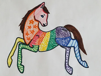
         I like drawing in my free time, and even though I usually draw flowers and people, sometimes I like to also draw animals. the basic animals to draw are cats and dogs and maybe bunnies but this time I tried to draw a little more complex animal such as the horse. Horses have long necks, long legs, and big bodies so sometimes it can be extremely difficult drawing an animal such as the horse, but through the guidance of tips, and techniques from my IRP book The Usborne Complete Book of Drawing designed by Nigel Reece and edited by Alastair Smith and and Judy Tatchell,  I have drawn a pretty good horse if I do say so my self.
       In the book, it says that all horses have the same type of structure for the head but even if they have the same structure, they can slightly different proportions such that one horse head can have a much leaner or less defined shape while another horse's head can have a more rounder and more defined shape (Alastair, Tatchell 33). In the drawing below you can see that the head of the horse I drew has a really well defined shape. I used the tips in the book to outline the shape and I did that with a black sharpie. also the head I drew is round and more fuller as you go from the mouth to the ears.  Another thing that the book stated that helped me with my drawing was how to draw the pace of the horse and I decided to draw the horse doing a canter. The book states, "This is a bounding, rocking, three-beat movement. The horse sets down one back hoof, then a pair of diagonals, the the last front hoof " (Alastair, Tatchell 35). In the drawing I drew, I tried to draw the horse doing the canter. I wasn't perfect but you could see that 1 leg is on the ground, 2 legs parallel and diagonal, while the front one looks like it will touch the ground last. Through the tips of the book, I drew a horse that resembles one in real life. I decided to be creative and color the horse in rainbow and add in different patterns just to give it a bit of a spark, but overall I would say the drawing came out great.

How do you think the horse came out?
Do you like that I made it with different colors and different patterns or would you just have preferred it as the normal colors?
If you like to draw, then what animals do you prefer to draw?
Smith, Alastair, and Judy Tatchel. The Usborne Complete Book of Drawing. Usborne Pub., 2009.
Wednesday, November 29, 2017

Drawing: Face


               I have been drawing for quite a while now. when I'm bored at home a draw. when I'm bored in school you could find me either talking to my friends or doodling in my notebook. In elementary school if we ever had to use whiteboards and I had extra time, I would draw random things on the white board. it is kind of a hobby of mine. I am definitely not the best drawer in the world but I could say that I draw pretty well.
            As I have been reading my IRP book which is The Usborne Complete Book of Drawing, designed by Nigel Reece and edited by Alastair Smith and Judy Tatchell, the first page is about people. The book states "People's bodies are made up of lots of different shapes so they are tricky to draw realistically. Don't try to draw a finished outline straight off. Instead, sketch rough shapes lightly and loosely until the proportions look right" (Smith, Tatchell 5). For the picture I drew, I drew a face and it took me a while to get the right proportions for the head, eyes, nose, mouth. I drew an outline of the head and then proportioned all the face features to the size of the head since that order makes the most sense. The words in the book are true, it truly is hard to draw a face without an outline.
           Another thing that I noticed while reading my IRP was the fact that they showed how to do different face angles so the face is directly straight. the book showed how you would angle the face with specific instructions and an angled view of a face is also called a profile (Smith, Tatchell  7). I personally think that drawing an angled face is hard but it turns out pretty cool after the finishing touches. In my drawing I drew a girl with an angled face and I actually liked how the drawing turned out.


Do you like to draw or doodle? If so what do you like to draw?
Did you like the way my drawing turned out? why or why not?
Was this a good thing to draw or should I have started off a little more basic?


Smith, Alastair, and Judy Tatchel. The Usborne Complete Book of Drawing. Usborne Pub., 2009.