Showing posts with label draw. Show all posts

Thursday, January 26, 2017

Face Characteristics

        Hello everyone, and welcome to my last blog! As my final blog, I decided to do something more challenging - the face. Since I felt that my skills are still not strong enough to draw an entire face, I decided to just focus on a part of the face instead.
        Because everyone's faces are alike yet so different, it's hard to make a portrait actually look like your model. I decided to focus on the nose and lips. Garcia, in her book shows that a nose isn't as easy to draw as it seems, "Since you're apt to focus on eyes and mouths more often than on noses, take a really careful look at the feature before you start drawing" (Garcia 114). It may be hard, but it's a start. 

The nose and lips I drew
        What I drew above is not anyone's in particular, it's just what I drew to try and make it look somewhat like a real nose and lips. Again, I used the advice of Claire Watson Garcia to help me draw this. In her book she advises to start at the bridge of the nose, then go on to the fleshy end, to the base, and finally to the nostrils of the nose (Garcia 115). You can't see it in my end drawing, but I started as she said, at the bridge of the nose. First, I made a line, but once I had the whole nose drawn out, I went back and adjusted the bridge of the nose, making it more gradual, like it's connected. With the lips, I made sure to use what I learned about shadows from my third blog. I also added creases along the lips, to make it more realistic, similarly like I did with the drawing of my hand. At the corners of the mouth, I also added the little creases, making the appearance of the mouth being tied in a bit.
        Overall, this IRP blog project has definitely helped me become a better artist, from sketching, to shading, to the face. Through this I think I also have found myself a new hobby, because I noticed that I may have a slight talent. As I have seen evidently through this project, practice helps you get better, by a lot!


        How did you enjoy this IRP project? Do you also feel that you've gotten better through even just these 5 posts?


Garcia, Claire Watson. Drawing for the Absolute and Utter Beginner. New York,
     Watson-Guptill Publications, 2003. 

Thursday, January 19, 2017

Dimension and Omitting Perfectionism

        Hi everyone, welcome back to my blog! On today's blog, I will be focusing on creating dimension and also omitting perfectionism, as seen in the title.
        I've never drawn a hand to make it look realistic, so this was a first. I'm not going to lie, though, I was excited to try it out, to see how far my skills and practice could take me. Luckily for me, Claire Watson Garcia left step-by-step instructions as a guide to how to draw a hand"
        "1. Trace your nondrawing hand, palm down, fingers together or spread.
             Draw the folds in your knuckles.
         2. Put in shadow shapes if they are present, squinting to see them.
         3. Use contour drawing to fill in specific nail shapes.
         4. Fill in an overall skin value and use your finger to smooth out the surface.
             Use your directional lines to map out rows of knuckles in a slight semicircle" (Garcia 69).
        I followed the given directions, and I'm glad I did. I never thought about tracing your hand, and only then adding the designated details to it, so it would turn out proportional and the right size. 
The finished drawing of my hand

        This is actually my hand, which means of course that I drew it not from a drawing. I was surprised with my end result. I didn't think it would look nearly as realistic as it does. Though it does look pretty good, it's not perfect. Sometimes that may annoy me, but Garcia teaches otherwise. No artist is perfect, and all the imperfections we make are unique to us, which makes every artist different, in their own way. Generally we are scared of it being imperfect because we are afraid of being vulnerable, of being ourselves in our art, and we need to get over that fear, because it's who we are (Garcia 68). The way that she worded made me think hard, because really, she's right. There's no point in trying so hard to make it perfect, because we'll never get it perfect anyways. Even though my drawing isn't perfect, I think it's decent; decent enough to be able to tell that it is a hand. That's what matters most.


Do you agree that perfectionism deprives us of our unique selves being shown through our art?


Garcia, Claire Watson. Drawing for the Absolute and Utter Beginner. New York,
     Watson-Guptill Publications, 2003.


Monday, January 16, 2017

Learn Drawing Quickly: Angle of View

For my third blog post, the next step to learn how to draw was to understand shapes and how they change to the human eye depending on the point you’re looking at them from. The example I decided to draw was the cup. The cup is an easier example to show the way it changes when looked at. When viewed from the top, it’s circular. But when looked at from a lower level the circle becomes an oval. In the book Lean Drawing Quickly, the author says that this gives your shape more of a realistic feel (Finmark 30).


In Learn Drawing Quickly the author says, “Basic shapes appear to change depending upon the angle from which you look at them- this gives your drawing the realistic appearance” (Finmark 30). So I drew some examples of what it would look like staring at a cup from different perspectives. This is my final product, I think I did pretty well, but I can improve and make the drawing look more as if you are looking directly at it.

Do you think drawing shapes as if you were looking at them are crucial to making the drawing look more realistic rather than adding the tone?

Saturday, January 14, 2017

Shading Shadows and Reflected Light


        Hello everyone, and welcome back to my blog! Today, I will be looking at the shadows of a drawing, and how to draw them correctly in order to make the drawing look as realistic as possible. 
        Whenever I draw something, of course I always add shadows, because the drawing wouldn't look like anything without them. But the harder part is to know how to add shadows. Where to add shadows at all, where should I make it darker, or lighter? How do I make a shadow transition smoothly as light usually would in real life, so it would look real? I decided to make a blogpost on this, to help me get better at this specific skill.
        Before I started though, of course I read what the author had to say, and what advice I should take to know what to go off of. As I was reading, a key piece stood out to me, "Soften the transition between shadow and overall value by using less pressure on your pencil. Put in the cast shadow, incorporating horizontal strokes to help the shadow lie flat. Show reflected light in the shadow, either by erasing shadow values or darkening around them" (Garcia 63).
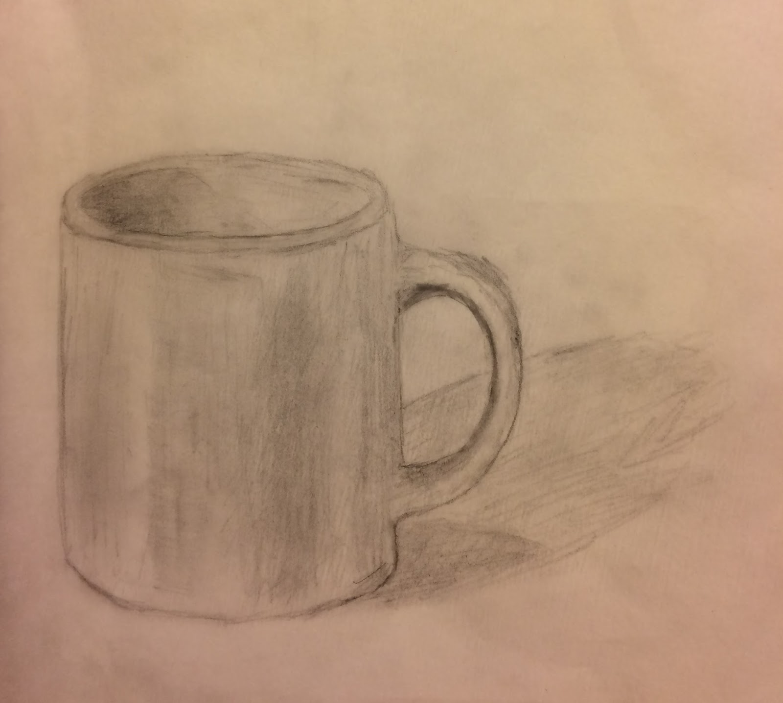
My finished drawing of a cup
        Instead of drawing off a real live model, this time, I wanted to try to draw from an already drawn picture. I thought it turned out pretty good, much better than I expected. I also changed the kind of paper I used, taking the advice of my peers. This paper is much less rough, and much easier to blur, making my shadows look a lot smoother than before.  Not only did that first piece of advice from the author help me, but also where Garcia talks about how you should use your finger to blur the shadows, and the edges, where needed. Also she states to change direction of you pencil often, with tighter scribblings, to make it easier to smooth it out (Garcia 63). All in all, I thought this drawing is better than my previous ones, and this book answered my questions, and helped me immensely.


        What do you think about my drawing? What could I improve on? Do you agree with the author to change direction of the pencil often to make it easier to smooth out a shadow?


Garcia, Claire Watson. Drawing for the Absolute and Utter Beginner. New York,
     Watson-Guptill Publications, 2003.

Friday, December 23, 2016

Learn Drawing Quickly: Texture With Color

Welcome to my second post! In this post I'm going off of what I have learned from my previous blog post. I've learned how to add texture to my drawings just by using a pencil. But adding in more than one color and making it look somewhat realistic is hard. I decided to use my last drawing; the clove of garlic to test out using texture with colored pencils.


This was my first attempt at using colored pencils to create texture and make the drawing look more realistic as the book says (Finamark 18). In Learn Drawing Quickly the author says, "By marking or smudging with color, you give the appearance of a more realistic object" (Finmark 18). Although it was my first try, it wasn't very bad for someone who hasn't done this kind of thing before.

What do you think? Is there anything I can improve on in making my drawing more realistic when I use color?

Wednesday, November 30, 2016

Drawing Simply


        Hello, my name is Alina Tarasevich, and welcome to my blog! My IRP blog posts theme will be drawing, and how to get better. I used the book Drawing for the Absolute and Utter Beginner by Claire Watson Garcia. Though I am not a super skilled artist, I decided to do this because I figured that with some practice, and tips, I could get good, and possibly even get faster at drawing accurately.        
        In general, my drawings aren't the worst, when I really try. But the thing is, they always take me so extremely long to draw. For example, to draw maybe even just a cup would take me a good 20 minutes, maybe even more, because I'd try to get it perfect. But this book points out that it's okay to not have a perfect drawing, and it's okay if there are faults in your drawing, or your drawing looks kind of weird, or disproportional. While you're still drawing, it may look super weird and disproportional, but in the end, it doesn't look so bad, and you can barely tell (Garcia 26). I can say this from my own experience, even with this cup drawing here.
The original cup I was trying to draw.
It's kind of hard to get the same perspective on camera as I was looking at, and the camera kind of distorts the cup. But this is the general idea.
My finished drawing


Here is my final drawing of the cup. I really thought it was going to turn out worse, because it looked very disproportional as I was drawing it. Then, as I started drawing more, and in the end it didn't look so bad, and it kind of resembles the cup I was trying to draw. "Once you're finished, you'll be surprised how little a few mismarks will matter - what is seen at viewing distance is different from what you see at 'doing distance'" (Garcia 26). I never really thought about what this meant, until I experienced myself, then I totally understood it. Though I could see there's something wrong with it, my brain can't pinpoint it exactly. But still, in the long run, it doesn't look too bad, right? 


Let me know what you think in the comments! What should I draw next time? Are you an artist? How could I fix my drawing so it would look more realistic? 


Garcia, Claire Watson. Drawing for the Absolute and Utter Beginner. New York,
     Watson-Guptill Publications, 2003.


Tuesday, November 29, 2016

Learn Drawing Quickly: Texture

For the IRP Quarter 2 project, I wanted to incorporate a new skill into my life. I have done many drawings in the past. Mainly very ground based sketches such as stick figures. Over the years, I began to be less interested in drawing. For one thing, I became discouraged because I'm not the best artist. Second, I didn't have as much time to keep drawing and it wasn't my number one favorite thing to do in the first place so I just disregarded it.

In this quarter, I hope to improve. Not necessarily becoming professional by all means, but just to gain a few new skills and be able to draw more than just stick figures. One specific area I look forward to in this project is seeing my overall development in the artistic field.

In my opinion, I think that art carries a deeper meaning beyond just the portrait itself. What I like about art is that anyone from anywhere can interpret it through their own experiences in life. To add on, I believe art isn't something one can achieve overnight. It is a skill in which it takes time and practice in order to see the progression.

For my first sketch, I drew something really simple. A clove of garlic. I did a scratch like surface to show texture in the drawing, as it says in Learn Drawing Quickly (Finmark 15). Drawing lines over and over again to show that the garlic had more of a feel to it, even if it’s on paper. Learn Drawing Quickly says, “Using pen or pencil, you can make scratchy lines to show a surface, building up to overlapping lines to indicate the darker tones” (Finmark 15).


In any new skill one partakes in, I strongly feel you have to put your all into it. Even if you feel like it isn’t to the best of your abilities. Art aids in the growth of patience and gives you more of an understanding of the world around you, even in the simplest drawings.


Does art make you think beyond just aesthetics?