Showing posts with label drawing. Show all posts

Sunday, January 28, 2018

Rotations, Spirals, and divisions with ellipses (Concept drawing)

Rotations for hinges can be accurately drawn using the techniques in my last post with ellipses drawn on surfaces by drawing along ellipses. Drawing a shape on any of the axis's presented by the ellipse can represent a door at any angle of the swing as an example.


To subdivide an ellipse, draw a half circle parallel to the ellipse drawn on a surface. Divide this half circle into even “pie slices” with a protractor or just eyeball it. Then, draw parallel lines through the intersecting points of the circle over to the vertical line of the ellipse, and then connect them to the other end of the surface following the vanishing point. Mark the intersection of the ellipse and the lines previously drawn and connect them to the center for perfect divisions on the ellipse. According to Scott Robertson, “being able to subdivide am ellipse will help with drawing things like spiral staircases, equally spaced links on a tank tread, hour positions on a clock, or teeth around a gear” (Robertson 16). These techniques are shown in this drawing of a gear that I drew. 
Question: What careers go with the style of concept drawing and drafting?  

Layering

Guide to Coloring~ Layering Colors 

Why color a picture with just one color when you can use three or more colors and tools to create a great layer effect! Layering is a way to artistically combine different media on top of one another to create a mixed-media piece. Layering incorporates different tools like markers, pencils and pens into one single picture. One thing to keep in mind when layering is that it is all about experimenting, all brands of markers, pencils and pens are slightly different in their colors and quality, so this is where you would experiment what color best layers with the other (Couch 77). Only by experimenting can you determine what different layering combinations work and which you like.

Before starting to layer on your picture you should do some test experiments. Some things that work best when layering include gel pen on colored pencils, gel pen on markers or colored pencils on markers. Here are some examples from the book...


Here are some that I did. Both 1 and 2 are gel pens layered on markers and 3 and 4 are gel pens layered on colored pencils. For my colors, the gel pens worked best on the colored pencils but still have a nice and dark impact on the markers. It brings a tint and shade sort of layering on the markers.

One last thing to consider, "...is whether the entire piece will include layering or whether just a specific area will and are you going to use a combination of markers and colored pencils over the entire piece..." (Couch 79). You should always know exactly what colors you are going to use to layer and where because if you decide to layer some colors on the spot, some just simply will not look layered due to the colors not quite fitting together.
Step 1
Step 2

For my picture here I decided to use colored pencils on a marker. First you would use your lighter color (my marker) and color in the picture lightly. Next you shade with the darker color (for me this was my colored pencil). As you see the picture in step 2 got a bit more darker and you can see the layers.


Lastly you can add a third layer with a nice alternative or corresponding color. I did this with the use of a dark blue metallic gel pen. This gave the drawing a nice shiny layer.

Step 3 is the last and optional step.

Here is another example I did. I used the same tings as before. First a light marker and then a darker colored pencil. Lastly the optional step by adding some dots with a gel pen. The gel pen accents create highlights and more dimension to the picture (Couch 80). Gel pens or even a third layer are not required at all, but to give your drawing a more lively image you can add them in small parts where necessary to create the little layered illusion.

Do you think layering adds another dimension to a picture? Do you prefer any ways  to layer your colors or coloring tools?


Couch, Peg. New Guide to Coloring for Crafts, Adult Coloring Books, and Other Coloristas!: Tips, Tricks, and      Techniques for All Skill Levels! Fox Chapel Pub Co Inc, 2016.


Ellipses and Circles (Concept Drawing)


Drawing circles in perspective:
                Ellipse anatomy- An ellipse has a minor and major axis, the minor axis cuts the ellipse in half across its narrowest section, and the major axis cuts it on the widest section. When it comes to drawing circles in perspective, which turn into ellipses, the major axis should be ignored since it would almost never cross the actual center of the circle. The minor axis on the ellipse will always point towards the vanishing point to make a circle. This makes the minor axis like the axis to a wheel.

                Placing ellipses on surfaces- according to Scott Robertson’s rules, to draw an ellipse on a surface, “the minor axis is always perpendicular to the surface on which the circle will be placed” (Robertson 73). To place the ellipse on a surface, first draw a minor axis perpendicular to the surface edge, then draw an ellipse around the minor axis, then draw a box around the shape and match the angle of the ellipse up to the angle of the box, which should match with the shape of the surface this is all on. 
Basic shapes using ellipses on surfaces


                Where are some examples of where you could use this technique in a drawing?

drawing and inking animal anatomy: Rabbit face, mouth and ear


Over the weekend I have decided to move into chapter 5. Chapter 5 is all about rodents, rabbits and ferrets. out of the many options given to me I have decided to draw Rabbits.

FACE/HEAD:

When I first started reading this chapter I didn't realize how complex a simple bunny head could be. "Some rabbit breeds have rather long faces and others have very short, round heads" (Amberlyn 126). When drawing the rabbit head I had to decide weather I wanted to have a rabbit with a long face or a short chubby one.

rabbit face/head

MOUTH/NOSE:

When people think about a rabbit they think of the cute little nose that wiggles when it sniffs, that's why it is crucial to get the nose right. "Rabbits usually have a wrinkling, V-shaped nose" (Amberlyn 128).  This is kept in mint when drawing a front face view not a side view because the mouth is not visible and only half of the nose is visible from the side view.

rabbit nose 

EAR:

Their is a piece of cartilage at the base of the rabbits ear which makes it hard and not flexible, but as you go up the ear it gets softer and more flexible (Amberlyn 129). I made sure ti keep this in mind when drawing the rabbits ears because the rabbit will then have wears that stand straight up.

rabbit ear 

mine
I like how this one came out. their was a lot of information in this chapter about rabbits which made it easy to draw. I do know that their is still a lot of improvement.

What do you think I could improve on for next time?
Will you use these tips next time you draw a rabbit?


Saturday, January 27, 2018

Drawing Nature

     After successfully drawing the basic shapes, I have decided to push myself further and draw some plants. Drawing flowers and trees are actually one of my favorite things to do.

     The first thing I made was a lily. When i was making these drawings, I thought I was done with the basic shapes. But I was wrong. Part of drawing the lily was to make a foreshortened circle. Then, Mark Kistler introduced a new technique: tapering. Tapering is narrowing your object to make it look like that part of the object looks like it is further away. "Tapering is another one of those very important ideas that you will start to notice everywhere now that you are aware of it" (Kistler 124). Using this new technique, I completed the lily (or lilies), and i think they turned out pretty good.


     The next object i drew was a tree. Using the tapering technique, I drew the trunk and roots. It took me so long to get this right in my mind because I am very self-conscious about the way my drawings look. Then as it came to the leaves, I used a special way to draw them (Kistler taught me this technique). You draw a circle, then draw little arches along the edge of the circle all the way around, and then lightly sketch some curly "Q's" inside the circle. Kistler says that having an odd amount of objects together, is a lot more visually appealing than an even amount (Kistler 166). Add some shading and wood grain texture and you got a nice looking tree.


     How do you think these drawings turned out? Could I have added more shading to the lilies, or made the tree slightly bigger?

Kistler, Mark. You Can Draw in 30 Days: the Fun, Easy Way to Learn to Draw in One Month or Less. Da Capo Lifelong, a Member of the Perseus Books Group, 2011.

Thursday, January 25, 2018

Drawing: Body

            For my last and final blog of drawing, I decided to go with the idea of my first drawing and draw another person. This time I decided to draw the body and not the face. I draw faces all the time, so i took it up a notch and drew a young girl who with our perspective has her back turned to us. The book The Usborne Complete Book of Drawing by Alastair Smith and Judy Tatchell, accompanied and navigated me throughout my process and journey of the piece I drew.
          The first thing I obviously need to draw is the outline of the body. In the book it states, "Begin your drawings of whole figures by marking a sketch of the body, using pencil. Start your sketch by drawing the rough shapes of the main body parts" (smith, Tatchell 10). In the drawing I first started with the basic shape of a head which is not circle but kind of like an oval. As I went along I drew the neck which will eventually be covered up and the the shoulders. The arms that I drew were not straight but they were slightly tilted inward as if she were holding her hands together. At first I drew her main body as a rectangle, lightly with a pencil before I added curves. The book gives very critical advice. Before i drew this piece I tried drawing a body before but it didn't turn out the way I expected because I tried drawing the clothes and everything, I didn't start out with the basics.
         The second and most important thing in my opinion is the stance or pose the body has. The stance of the girl I drew is with her back towards us as i mentioned before. The great tip that the book gave was that when they said, illustrating poses and proportions is exaggerating the drawing of the body. To emphasize the drawing, there can be different styles of clothes such as ones that are elegant  or comfortable (Smith, Tatchell 18). I took the advice from the book and gave a girl a pretty and flowing dress with an intricate design. I drew a dress that was strapless and her hair was down so you couldn't see her whole back. I drew a band around her upper waist and then the design below that.
       All in all I think the drawing turned out superb. This was the first time I drew a person without the face showing and I am glad i took the risk and learned how to draw more. I would like to say that drawing is not always my forte. I only draw good when i'm in the mood to draw and I can't be forced to draw. Over this 3 moth period, I found time when I was in the mood to draw, and drew these pictures with all my effort and focus. Hopefully to your eyes they turned out good.

How would you say this drawing turned out?
Do you like the drawing without the face or would you have preferred it with the face?
If there is anything i can change, fix, and add what would it be?

Smith, Alastair, and Judy Tatchel. The Usborne Complete Book of Drawing. Usborne Pub., 2009.

Creative Drawing: Body shapes and summing it up

David Phan

Drawing: The Only Drawing Book You'll Ever Need to Be the Artist You've Always Wanted to Be by Kathryn Temple

In my last blog, we learned how to draw a face. In this blog, we’ll continue and learn how to draw the rest of the body. In Kathryn Temple’s book Drawing: The Only Drawing Book You'll Ever Need to Be the Artist You've Always Wanted to Be, she delves into the idea in depth. In chapter seven of her book she says, “Simple shapes will help you draw the human body…Their necks, arms, torsos, and legs are all a series of tubes. The hips, shoulders, and elbows – all of the joints – are made out of spheres” (Temple, 92). Temple continues by showing simple steps on how to draw these tubes and spheres, outlining them, and adding finishing touches to create a more detailed body.

In my attempt, I’ve decided to draw a body, but add on to it by combining the skills I’ve learned like landscape and shadowing. First, I start by building the body. I use the tubes and spheres as Temple described to make a skeleton of the body. After I had the shape I desired, I outlined the body and added details such as clothing, curves, and finishing touched to smooth out the figure. Then I created the landscaping in the background with the landscaping rules I learned from one of my previous blogs. Finally I finished the tree upon which my figure had been resting on.


How would you combine your drawing skills from my previous blogs to create something new? What would you draw, and why?

Works Cited


Temple, Kathryn. Drawing: The Only Drawing Book You'll Ever Need to Be the Artist You've Always Wanted to Be. Sterling Children's Book, 2014.

Wednesday, January 24, 2018

Drawing: Grass-Like Flowers

Well, we made it! The very last post of this blog! I have learned so much about myself as an artist and the methods that work for when I am doodling. For the final pictures, I decided to draw some flowers. But unlike other flowers that are in the shape of bushes or grow on trees, these flowers live among the grass and have similar characteristics. To start, I drew a flower called a rape blossom. The leaves of this plant are actually edible, and the seeds can be used to make oil. How handy! To draw this flower, I first drew buds of the flower in the foreground, followed by the background. I then drew the stem of the plant, and finally, I added leaves and seeds to the stem, alternating from the top down (Umoto 26). In drawing this picture, I included most of the techniques that I focused on in my other posts: step by step process, detail, complex images, and shapes. This really helped me to incorporate everything in to one piece and produce something that fits into many artistic categories. For the second drawing, I sketched pampas grass. In this doodle, I mainly focused on detail and the step by step process to create the end result. To create this image, "1. Decide the direction of the wind before drawing the stalks. 2. Draw the outline of the plumes fluttering in the wind. 3. Draw the defining lines in each plume one by one and the leaves" (Umoto 70). Following the given instructions and attempting multiple times to sketch the perfect flower, I finally completed this doodle and was satisfied with the result. I am proud of the accomplishments I have made during these past couple months, and I think that I will go forward using what I have learned and applying it to my daily life.


Would you rather draw flowers like the ones in this post or ones in the shape of bushes and trees? Why?

Umoto, Sachiko. Illustration School: Let's Draw Plants and Small Creatures. Quarry Books, 2010.

Sunday, January 21, 2018

Cylinders, Volcanoes, and Coffee Mugs

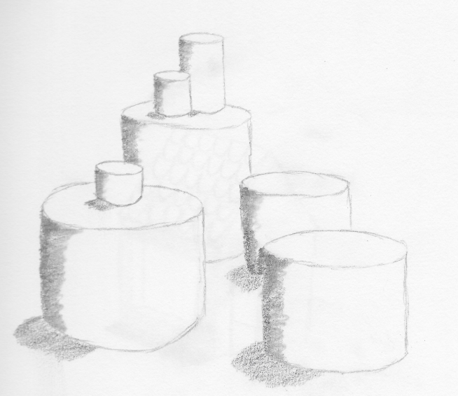
     After drawing spheres and squares, I am drawing the last basic shape in the book, Cylinders. Cylinders are probably the most difficult of the basic shapes. You have to make sure the top of the cylinder is foreshortened and, according to Mark Kistler, make the bottom curve a little more rounded than the top curve (Kistler 100). Regardless, they are fun to draw and I got a little carried away during the lesson and did a lot more than Kistler taught me.


     Later, I learned how to take the cylinder shape even further and drew a volcano and a coffee mug. I noticed a lot of drawings that i made have a lot of foreshortened shapes in them. Mark Kistler says, "Recognizing foreshortening and other laws of drawing in the world around you will help you learn how to draw in 3-D" (Kistler 158). That made me realize that foreshortening is one of the most important part in drawing.


     Do you think that foreshortening is one of the most important part in drawing? Or is there something of even more importance?

     Kistler, Mark. You Can Draw in 30 Days: the Fun, Easy Way to Learn to Draw in One Month or Less. Da Capo Lifelong, a Member of the Perseus Books Group, 2011.

Creative Drawing: Drawing Faces


David Phan
Drawing: The Only Drawing Book You'll Ever Need to Be the Artist You've Always Wanted to Be by Kathryn Temple

The face, and particularly the eyes, can be the most difficult things to draw due to the complexity of every individual’s unique facial features. To help with this difficult task, I’ve used the help of Kathryn Temple’s book Drawing: The Only Drawing Book You'll Ever Need to Be the Artist You've Always Wanted to Be to understand the hidden quirks that seem to hide beneath these intricate illustrations. In chapter six of Temple’s book she iterates, “The endless variety of the human face makes it even more amazing that most faces follow some basic rules of proportion and shape” (Temple, 76). Temple goes on explaining the basic rules around the drawing of faces, and focuses on the idea of drawing simple shapes like lines and circles (from my previous blog) to create the complex illustrations that she shows off (Temple, 80).

My attempt at the drawing shows the guidelines of the steps she takes. I took a different approach by drawing the eyes first as I would rather change the face shape than change the eyes if the proportions are wrong. Then I create a rough outline of the head by drawing circles and ovals, making the round head shape. Next, I draw the nose, the mouth, and the ears, crating shadows and textures along the way and smoothing out the edges if the proportions don’t seem right. Finally, I add the hair and the finishing touches to my piece, and changed the curvature of the chin a bit to make the proportions look cleaner.


With the idea of using simple lines and circles to make complex drawings, do you think you could draw something as intricate as a face? And if you were to draw a face, would you draw your own face, someone else’s face, would you create a face based off of your idea of an ideal face shape, or something more creative?


Works Cited

Temple, Kathryn. Drawing: The Only Drawing Book You'll Ever Need to Be the Artist You've Always Wanted to Be. Sterling Children's Book, 2014.

Saturday, January 20, 2018

Drawing - Color

               The entire world is painted in color, from the blue sky to the green grass. Imagine a world without color.  It would be gloomy and depressing. Color is one of the most important aspects of a place. Every day we look at hundreds of different shades. I decided the topic of my last post should be color.
             
             A surprising fact is that color doesn’t really exist. It’s just a reflection of light. During the seventeenth century Isaac Newton did an experiment using a prism and a white light. He discovered that objects actually have no real color, they merely absorbed light rays, and the color that wasn’t absorbed is reflected to our eyes. (Lauer 226).
               
              There are hundreds of different color properties, but I decided to focus on using cool and warm colors. David Lauer, author of the book Design Basics, explains the concept of warm colors saying, “Touching an area of red will assuredly not burn your hand, but looking at red will induce a feeling of warmth” (Lauer 239). Warm colors are reds, yellows, and anything similar to these. You think of warm things when you see them like the sun, or a fire. Cool colors are blues, greens, and purples. In contrast to being reminded of heat, cool colors remind you of ice or snow.
              
           I wasn't sure what I wanted to draw, so I turned to Google for inspiration. Eventually, I decided to draw scenery with hills and a beautiful sunset in the background. First, I lightly drew an outline of where I wanted everything to be with a pencil. Then I drew out three trees with a black sharpie. Next, I colored in the hills with colors like green blue and purple. Finally, I drew a sun and colored the sky with yellow, orange, pink, and red. The warm sky, contrasts the cool hills. I really enjoyed not only learning more about using color in art, but also a scientific background on what color was.


Do you prefer to use color, or leave your drawings black and white?

Where do you see color in the world?

Lauer, David A. Design Basics. third ed., Thomson Learning, 1990.

Friday, January 19, 2018

Drawing: lettering

         I have created many drawings of many different things such as flowers, animals, and human beings, but the side of art I haven't got a chance to explore yet is with words. In all of my drawings I have never added a single word and I know the infamous phrase "pictures speak a thousand words", but adding just 1 word can make the picture speak a thousand and one words. Adding words to a picture or drawing not only enhances the drawing itself, but also gives more depth and meaning to that specific piece of art. Through the tips and techniques from the book The Usborne Complete Book of Drawing by Alastair Smith and Judy Tatchell I have been able to create 2 pieces filled with words that speak to ones heart and a drawings that touches ones soul.
        Sometimes its hard to think about what to write in a drawing but the way I started my drawing was with a heart in the center of the page and then a band going around it with petals and flowers on the outside. The key to this piece was going to be the phrase i was gonna write. In the book, the authors state, "Small letters are just over half as tall as capitals, Small letters sticks and tails extend above and below the guidelines by about the same amount" (Alastair, Tatchell 112). Knowing that smaller letters are smaller than the capital letters is an obvious, but it is still important to show which letters are smaller so they don't all seam big. The Phrase I chose was "Fill Life with Love", it fits into the theme with the heart and the roses but I can also use the tips from the book that fell me about the sticks extending above the guideline and the tails going below the guideline. I wrote in cursive so the only letter that went below the guideline was the smaller letter f.

   I decided to draw 2 drawings for this blog to show that there are many different styles of words that you can incorporate into a piece. The 2nd piece I drew was a little less serious and maybe a little more humorous. In this piece i drew a bee as a picture and then wrote the word happy with an exclamation mark under it. I wanted this piece bring life into someone's eyes so the type of lettering I used was comic lettering. According to the book, this type of lettering is supposed to look like one that has been handwritten, meaning that is could be a little shaky or even a little uneven. And they said we could even use our own handwriting as a starting base (Alastair, Tatchell 118). I used the tip of using my own handwriting as a base to start off my letters. I usually draw most of my letters with like a swoosh in the end such as with an h or a y. So for my lettering in the drawing i decided to go with that technique of mine and even though it didn't come out perfect, it related back to comic lettering since this type of lettering isn't supposed to be so precise and could be shaky or uneven here or there.
      All in all, I would say the letters of both of my pieces came out pretty good. Not at all perfect, but I drew them to the best of my ability and spent my time worthwhile.
     How do you think that my drawings and lettering came out?
     Do you think that adding words to drawings gives more meaning or emphasis?
     If you draw, have you ever added words or will you ever in the future?

Smith, Alastair, and Judy Tatchel. The Usborne Complete Book of Drawing. Usborne Pub., 2009.

Monday, January 8, 2018

Drawing: Strawberries & Lemons

I'm not going to lie, I was definitely thinking about summer when it came to the drawings for this post. Just think about all that delicious lemonade...But no. It's winter, and that means I can only dream about summer. With these doodles, I focused on drawing them step by step as usual, but I also considered the shapes that I was drawing. I really tried to make all the shapes of each step look the same, instead of getting within the ballpark and calling it good. Starting with the strawberry, "1. Draw the outline of the strawberry. 2. Draw the calyx. 3. Draw the little seeds on the surface" (Umoto 86). The general shape of a strawberry is almost like an oval, but with one end pointed a bit more. The top (calyx), leafy bit of the fruit includes a rectangular stem and semi-circle-ish leaves, and the seeds are shaped like mini ovals, filled in. Once finished, I was able to not only see a piece of fruit, but also all of the shapes that make up the doodle. The lemon, however, was a little bit harder. To start, I drew an oval shaped like the lemon. I then drew the protruding parts on each end, and added the spots on the surface, just as directed (Umoto 86). The oval was simple, and so was one end of the lemon, which was just a rectangle. But the other side was tricky. I had to draw a little wave, that almost looked like a really stretched out letter "m". It took me a few tries to get this bit to my satisfaction, but I managed. The last step, adding the spots, was similar to step 3 of drawing a strawberry, so it was not too challenging. Shapes are everywhere in the world; every object is a shape or a combination of them. Overall, I was pleased with the outcome and my ability to think about and identify the shapes in each of these pictures that have me longing for that summer sun.


Take an object or two that you see everyday; what shapes contribute to this object? If you were to draw it, would it be easier to draw the shapes that it's made of or try to draw the whole object at once?

Umoto, Sachiko. Illustration School: Let's Draw Plants and Small Creatures. Quarry Books, 2010.


Sunday, January 7, 2018

Drawing - Scale/ Proportion

          After looking through what techniques were left in my book Design Basics by David A. Lauer, I decided to try drawing something with different scales/proportions for my next piece. These two words are very similar, as they both relate to size, however are slightly different “Scale essentially is another word for size; ‘large scale’ is a way of saying big, and ‘small scale’ means small… Proportion refers to relative size, size measured against other elements or against some mental norm or standard” (Lauer 80). I attempted this technique by drawing a simple flower with a lady bug sitting on one of its petals. The flower is considered large scale because it takes up most of the space on the paper, and takes up most of our visual attention. The lady bug is the small scale, since in comparison with the flower, it is much tinier, and can be looked over at first glance.

          First, I started by sketching the flower. This seems very simple, but I had to draw it twice because I was unhappy with the way the petals looked the first time; some petals were too long, or too wide. Once I was happy with the way the petals looked, I drew the little lady bug. Next, I outlined the pencil lines in black, and colored everything in. This is the first drawing I used color in and I’m really happy with how it turned out.  I feel it made the piece stand out much more.

          Tying this piece pack to my first piece, scale and proportion often go with emphasis and focal point. Large scale is a visual emphasis, and the eye naturally is drawn to the largest figure in a piece, creating a focal point. (Lauer 80). This just shows how everything is connected. Most pieces have multiple art elements or techniques used. Trying out so many new techniques has helped me increase my knowledge and skills on drawing.

Have you ever drawn something using scale and proportion?
What’s your favorite drawing technique?


Lauer, David A. Design Basics. third ed., Thomson Learning, 1990.

Sunday, December 31, 2017

Creative Drawing: Landscape and Perspective

David Phan
Drawing: The Only Drawing Book You'll Ever Need to Be the Artist You've Always Wanted to Be by Kathryn Temple

In order to be able to draw, you'll need to know where you're looking from, or your perspective. In Kathryn Temple's book, Drawing: The Only Drawing Book You'll Ever Need to Be the Artist You've Always Wanted to Be, Temple talks about different perspectives and their purposes. The one I'd like to highlight here is landscape perspectives. Temples delves into the process by stating, "I used these tricks of what's called atmospheric perspective to create the illusion of open space: Things get fuzzier the farther away they are; Things tend to appear lighter in value the farther away they are; Things appear to get smaller the farther away they are; Things appear closer together the farther away they are" (Temple 74). These four rules of landscape drawing allow the piece to show where everything is exactly, and allows you to judge the distance between each object in your drawing.

In my drawing, I've decided not to use a picture this time. Instead, I'll use what I know of my own surroundings (living in Washington means there's plenty of trees to look at!) and Temple's advice on landscape drawing to create an image of a meadow with a forest and mountain backdrop. I decided to contrast the image with a wild fire as well to make it more interesting. Here, you'll see I used the landscape techniques by blurring the background, defining the foreground, and shrinking the backdrop. I also used the shadowing and realism techniques from before to give it a final touch.

Do the landscape techniques really seem to allow you to judge different distances in the drawings? How do you think the blending of shadowing and landscape techniques helps give the drawing better depth?


Works Cited
Temple, Kathryn. Drawing: the Only Drawing Book You'll Ever Need to Be the Artist You've Always Wanted to Be. Sterling Children's Book, 2014.

drawing and inking animal anatomy: horse face, front leg, and ear


    Over this part of the break I continued to read into chapter 3, which is about horses. "The horse is considered by many to be a living work of art. It combines grace and power in one beautiful package"(Amberlyn72).

Simple geometric outline:
    The title of this one gives away what this section of the chapter is about, but it is just a rough geometric out line of what the head is going to look like by using simple shapes, such as, triangles, squares, circles, and ovals. "Note how the tear duct roughly aligns with the bottom line of the mouth/jaw"(Amberlyn74). 
Rough geometric outline 

Front leg:
    For this section I only drew the front leg just to get the essential understandings. "The horse essentially has one very long "finger" and is walking on its fingernails"(Amberlyn81)" This step by step picture helped me a lot when drawing the front leg and hove. 

Front leg 

Ear:
    The ear of a horse is in a teardrop like shape. "Horses can move their ears to listen to sounds or express emotions" (Amberlyn77). The ear can move in different directions based on its emotions or the situation that it is in.

Basic shape of ear 

Mine
What do you think about my drawing?
Was this information helpful?
What can I improve on?
Any questions?


Saturday, December 30, 2017

Foreshortening & Cubes

     Now that I have been able to draw spheres decently, I am on to drawing cubes. Apparently, cubes can be used to draw just about anything. To start drawing, a cube, you have to draw a foreshortened square. Mark Kistler says that foreshortening is a distortion to make one part of a drawing look closer than another (43). This way, it looks like you are staring at the side of the cube, rather than the top. Here is a little more advanced cube that I drew:


     As you can see, where the inside of the box is, that is a foreshortened square, which makes the drawing look distorted.

     Soon i learned how to stack 3-D rectangles, which follows the foreshortening above. However, Kistler mentions a crucial thing when stacking anything with a foreshortened square. He says "When you draw the back edges of the top of the pedestal, be sure to go behind the corner of the post" (Kistler, 68). If this is not done, then it ruins the foreshortening effect as well as making the drawing look weird

     Then i took those two techniques, combined them, and made this:


     What is your opinion on foreshortening a square to make a cube? Do you think this is the best way to make a cube or is the anything better?

Kistler, Mark. You Can Draw in 30 Days: the Fun, Easy Way to Learn to Draw in One Month or Less. Da Capo Press, 2011.

Friday, December 29, 2017

Drawing - Value

               Over the break I decided to spend my extra time working on improving my drawing skills. For this piece, I created something using value. “Value is simply the artistic form for light and dark” (Lauer 214). To use this technique I drew a feather, making the bottom very dark, and lighter towards the top.
              
             I started by drawing the outline of the feather and created multiple sections inside. Then I filled in the bottom and worked my way up each section, making each one lighter. I used my finger to blend out the pencil and shade the top, so it would flow smoothly. Shading and blending has always scared me, and I never thought my art skills were advanced enough to use, but trying it out really helped me develop my abilities. I found that adding shading and using different blending techniques can make a drawing more realistic and three - dimensional.

              
              Value - contrast is the relationship between areas of dark and light. Since my drawing goes from light to dark in a consecutive order, the contrast between two connecting areas is very small and considered a low-value contrast. (Lauer 214). A high value contrast example would be an area where black and white touch. The difference in these shades is extreme.

            I'm really happy I decided to try something outside of my comfort zone because I was able to learn something new to apply in the future. Now I know a technique that will allow me to create drawings that are more realistic.

Have you ever tried using value in your artwork, and if you have, do you like it?
Do you think adding light and dark elements makes a piece look more realistic?

Lauer, David A. Design Basics. third ed., Thomson Learning, 1990.

Patterning

Guide to Coloring ~ Patterning


A great thing for beginners to make their drawings more intricate and advanced is simply by adding unique and even basic designs to your drawing. This task can seem daunting but in fact it is really quite simple. Patterning involves the use of different shapes and lines to add some nice details to areas of coloring design, all patterns no matter how complicated are made up of basic lines, dots and shapes (Couch 52). If you can draw a square, circle and curvy/wavy lines, you can pattern! Basically whatever shape you can think of can be turned into a pattern.

A pattern in the most basic form would just be a shape or design repeated over and over. It is how you put the pieces together and all the different variations you incorporate that allow unique simple patterns to become diverse advanced ones, all by using simple shapes and ideas. Some examples of basic patterns are...

Mandala templates are very good when working with patterning. "Mandalas in particular are great for patterning because you can repeat patterns in symmetrical areas easily and create a very cohesive, polished final piece without a ton of planning" (Couch 57).  Basically Mandalas are simple drawings like a bird or plant that have already started out with simple basic outlines of the thing being drawn but with plenty of blank space and this is where you would draw all your patterns to make the basic picture much more intricate. I had many examples of Mandala templates in my book, but of course you can always search some up and copy and sketch those down. For example here is mine...

As you can see the picture on the left, I started off with a flower and worked my way outwards by just adding more flower layers. This is the main base aka the Mandala template because it has so much blank spots left for me to add in more design and patterns.


On the picture on the right is where I added some basic curves, lines dots and some squiggles. As you can see the basic flower has become much more detailed and makes the drawing seem much more advanced.

Here is the final result. I am very satisfied with the outcome! I always lacked patience but patterning did not really take up as much time as I thought it would and the best part is that it is quite simple and anyone can do it! As always you can add color to bring the piece to life, but I wanted to focus more on the patterning part for today.

Have you ever tried any forms of patterning? Do you think basic patterns give a piece more attention or does it make it more sloppy? 

Couch, Peg. New Guide to Coloring for Crafts, Adult Coloring Books, and Other Coloristas!: Tips, Tricks, and      Techniques for All Skill Levels! Fox Chapel Pub Co Inc, 2016.

Thursday, December 28, 2017

Blending

Guide to Coloring ~ Blending 

By getting further into my New Guide to Coloring book I have learned of another simple technique to make drawings a bit more creative and fancy looking. It is a simple technique called blending. Blending refers to two different things that have a lot of overlap: mixing colors together to create a new color and also seamlessly shifting from one color to another to create a gradient effect (Couch 68). Blending is an essential for more advanced coloring and creates more beautiful, smooth rainbows in your designs. 

Mixing colors is pretty straightforward you just mix two or more colors together to create a new colors. So I will explain more on the transitions and gradients and overall blending finishes. "To use blending to create gradients and transitions...begin working with a light and dark tool of the same color family...the light color will be your base color "(Couch 70). Blending works best with two similar colors from the same color group because then it really gives the effect of two colors colliding and mixing together. Colored pencils are best to use when starting out this technique, the colors have have chosen are a light and dark green. I will be trying something fairly simple by blending a leaf.
Base Step: First you start by coloring your 
drawing (start simple like my leaf) with 
your light color over the entire area you 
want to blend. 

Next Step: Once your satisfied with the base layer use your dark shade to color lightly from the middle of your base color toward one edge of the shape. As you move further away from the area of the base shade apply more pressure to your pencil.
Last Step: Once you have added your darker color go
back with your light base color and color over the entire
area you've previously colored with the darker shade.
Redo process if needed ti create a nice and even coat of your color,
blending from light to dark. 
Here is the final result, as you can see
the leaf is darker at the bottom and
slowly starts to lighten up causing the
gradient and transitioning effect. 


Do you think its simpler to just mix two colors or blend the colors with the transition method? 
Do you have any favorite techniques you use in your coloring's/drawings? 
Couch, Peg. New Guide to Coloring for Crafts, Adult Coloring Books, and Other Coloristas!: Tips, Tricks, and      Techniques for All Skill Levels! Fox Chapel Pub Co Inc, 2016.