Sunday, December 31, 2017

The Art of Sign Language


          The next section of my IRP Q2 book focuses on two things. It focuses on colors in order to help with description (which were fairly basic), and also common places around town. These signs are more complicated than those previous, and required more practice to get them all down. The text gave some helpful tips, "As you expand your vocabulary, remembering words or phrases can become quite difficult. Try to remember signs by how they relate to what they are or by a part of the sign that relates to another sign. For instance, a tip to remembering colors is by remembering the first letter of that color, as many colors have signs based off of the first letter", (Brown 35). This tip was very helpful to memorization, and helped me remember signs such as "gas station", which I remember with ease as it is spoken by performing an action similar to pouring gas. Brown also provides long, often whole-page sized step-by-step pictures that help work through longer and more complex signs for words that, in English, are simple. This includes the picture guide for the difficult sign, "convenience store", (Brown 37). This particular set of images was of great help to my learning, and made the previously very tough sign seem much simpler.

  • I show the colors of the rainbow, pink through purple, and then show white, gray, and then black.
  • I show the signs for common town places, in order:
  • Bank, clinic, convenience store, gas station, fire station, grocery store, hospital, hotel, mall.

            When it comes to being in a foreign place, whether it be across country borders or simply in a social interaction with a deaf person, how far should one's knowledge of the foreign language have to extend? Should you have just enough to communicate in an emergency, or should you be able to undergo basic conversation with a native speaker?


Brown, Christopher. The Art of Sign Language: Phrases. Vol. 2, Thunder Bay Press, 2003.
By Noah Crissey

Rabbit Skin Tanning

In the event you catch a prey item such as a rabbit or deer. You can harvest the skin to make clothing,  pouches and cordage. In the SAS Survival Handbook by John Wiseman it explains how. There are many ways to tan a hide, most call for salting the skins, scraping off any excess skin and blood and leaving it to dry for a day or so. "Stretch the skin as tight as possible and leave it in the sun to dry it out. All the moister must be drawn from it so that it will not rot. Rubbing salt or wood ash into the skin will aid the process." (Wiseman 317).  I found I had more luck with salting the skins as opposed to using wood ash because it dried the skins much faster. But during the process of scraping off the excess skin I cut a hole in the skin. The more effective way of cleaning the hide is scraping it around a tree, this ensures that the skin does not get punctured. I used carpet nails on a piece of plywood to stretch the hide. After that I spread salt all over the the hide and let them dry for a day. In the end the hides turned out good but they were paper like and would probably not make good clothing. What should I have done differently to avoid this low quality tan. 

 Work Sited
John Wiseman (Author). “SAS Survival Handbook, Third Edition: The Ultimate Guide to Surviving Anywhere Paperback – November 11, 2014.” SAS Survival Handbook, Third Edition: The Ultimate Guide to Surviving Anywhere: John Wiseman: 8601411364013: Amazon.com: Books, Collins, www.amazon.com/SAS-Survival Handbook-Third-Surviving/dp/0062378074.           

Making fishing spears

In a survival situation you may find yourself without fishing gear but that doesn't mean catching a fish is hopeless, you can use a fishing spear. In the SAS survival handbook by John Wiseman, he shows how to build such spears. "Sharpen a long stick to make a spear, adding barbs to make it more effective." (Wiseman 238) To make my spear I cut a long piece of maple wood, but any long straight wood will work, and the first one I simply sharpened with a knife. The second spear I added three prongs on the end and secured it with cord. I found both spears had their merits, the simple spear penetrated deeper into the unsuspecting cardboard box where as the three pronged spear stuck much shallower. But the reason for the multipronged spear is to give more surface area in which you can hit your target. So you sacrifice penetration for a higher chance of making a hit. Just like it says in the book. "Give yourself a wide margin for error since it covers a larger area." (Wiseman 238). Which do you think would be the most effective spear for survival spear fishing.


Work Sited
John Wiseman (Author). “SAS Survival Handbook, Third Edition: The Ultimate Guide to Surviving Anywhere Paperback – November 11, 2014.” SAS Survival Handbook, Third Edition: The Ultimate Guide to Surviving Anywhere: John Wiseman: 8601411364013: Amazon.com: Books, Collins, www.amazon.com/SAS-Survival-Handbook-Third-Surviving/dp/0062378074.


Java: Abstract Classes and Interfaces

Building on what I learned previously, Java also makes use of abstract classes. These special objects can't be used on their own, but are more of a building block that other, more complex objects are built upon. "An abstract class has no life of its own. In order to use an abstract class, you have to create an ordinary (non-abstract) class that extends the abstract class" (Burd 419).

From the last example, I made an abstract class called Command. This object can't be made on it's own, as it has no actual function, but is what makes sure that all future commands based on this will follow the same hierarchy.

These abstract classes are important because without the class being abstract, someone, including yourself, might accidentally try to create an instance of the abstract class, which shouldn't happen. Adding abstract ensures that the code won't be misused accidentally. By adding abstract methods, or functions, this means that all classes that are based on it must create their own code for those methods. The benefit to using abstract classes to be extended over other similar types of classes such as interfaces is that a child can only inherit from one abstract class, but can inherit from many interfaces. This means you can limit the inheritance of a child, preventing a mess of many different inherited methods and variables.

However, with interfaces, a child can inherit from many different interfaces at the same time. This means that you can have an interface for commands that are for staff and commands that are only allowed to be used in certain groups. As an example, "[Barry is] an instance of  a Person class with all the fields that any person has - name, address, age, height, weight, and so on. He can also implement more than one interface: Because Barry implements a Professor interface, he must have methods named teachStudents, adviseStudents, and gradePapers. Because he implements an Author interface, he must have methods named writeChapters, reviewChapters, answerEmail, and so on" (Burd 411).

Here I made a command that is used to change the prefix that is used before a command in chat so that the program can tell the difference between a chat message and a command. The command extends a command, so it inherits the structure of a command, and also implements StaffCommand and RestrictedCommand. The StaffCommand inheritance requires the permissionLevel function which gives a number used to represent a hierarchical system where the lower the number, the less permissions the user has. Therefore, this command requires a user with permissions of 4 or greater. The RestrictedCommand inheritance requires the canUseCommand function. This takes the chat channel that the message was sent in and if the channel's ID matches the one provided, the command can be used. Otherwise, the command will not be run.


Do you think that having multiple systems of inheritance is more confusing, or is it nice to have a greater variety of tools to work with in order to keep everything organized and categorized?

Works Cited:
Burd, Barry. Java for Dummies. 7th ed., John Wiley & Sons, 2017.

Checkmate with Rook and King

Previously when I continued reading my book Chess for Juniors, I was learning how I could result the match in a stalemate (in other words a tie). However I was curious if I would be able to achieve a checkmate, by just using 2 pieces. I was in luck, on chapter 15 it showed exactly that. As I went into the chapter it showed me how I could win by just using 2 pieces, a Rook and my King. However there was a catch, even though it showed me how to win it also showed me how I could result the match in a stalemate (losing my chance to win). So this mean I would have to pay close attention to my following moves and avoiding the moves that the book had listed not to do, and also to take out all of the other pieces.

Now its time to try this method out, of course I have to take all of the other pieces out and set the pieces up the same way as the book did. Then I started to follow the books directions, "As the Rook moves up one rank at a time, the Black King will have fewer and fewer squares available." So after following the books direction I became closer to checkmate. Then I followed their continuing steps "4, Kd3 Kd5, step 5 Ra5+ Kd6." by following steps you are able to reduce the amount of steps that black is able to move and being one step closer to winning. So by then following the third to last step, "6 . . . Ke6 7 Ra6+ Kd7 8 Ke5 Ke7" I was reducing the Black king to only 4 squares to move. Moving on to the next step which is the second to last move, "11 Kd6 Kb8 12 Rc7" so by doing this the Black king is even more limited to move because it would only have 2 squares left to move, which means it can only move back and fourth. Last but not least the most important move, to finally end the match, "12 . . . Ka8 13 Kc6 Kb8 14 Kb6 Ka8 15 Rc8++." However, before the match ending move the book said a move that you shouldn't do or else the match would become a stalemate, " Rb7" and you would lose your chance to win. So because I avoided the that move I was able to win with just two pieces a Rook and a King.
Starting Point 
Step 4 
Step 5 
Step 6 
Step 7 
Checkmate

Work Cited 
Snyder, Robert Michael. “Chess for Juniors: a Complete Guide for the Beginner.” Chess for Juniors: a Complete Guide for the Beginner, David McKay Co, 1991, pp. 173–178.

Question: Have you guys ever tried to win with just 2 pieces left? If you tried using only a rook and a king to win before, did you win or made the mistake of resulting it into a stalemate?


Creative Drawing: Using and Finding Lines and Shapes

David Phan
Drawing: The Only Drawing Book You'll Ever Need to Be the Artist You've Always Wanted to Be by Kathryn Temple

Complex images may seem like a daunting challenge to face, with intricate designs and quirks that make it pop out. So how do you replicate that in your own drawings? Kathryn Temple delves into the solution in her book, Drawing: The Only Drawing Book You'll Ever Need to Be the Artist You've Always Wanted to Be, by using the idea that any shape can be broken down and simplified into basic shapes and lines. Temple explains the concept creatively, saying, "The lines we use in drawing often represent the edges of an object, or the point at which one thing overlaps or bumps up against another thing. Learning to draw with line is like learning a new language. You have to translate what you see - three-dimensional objects that take up real space - into the two-dimensional language of line" (Temple 20).When you apply this concept into your own drawings, Temple goes on talking about how you have to identify each of the lines and shapes inside of what you want to draw, then combining them to create the full picture (Temple 22).

First, I chose my picture, which I decided to draw Cinderella's Castle at Disney Land (since I had just been there recently). Next, I identified the lines and shapes within the picture I was drawing. Then, I put together the pieces to make an outline of my drawing. Finally, I used shadowing and realism elements from my last post to create the final product.


Do you think this technique of finding lines and shapes really helps with complex drawings, or do you think that it's just an extra process that'll slow you down?


Works Cited
Temple, Kathryn. Drawing: the Only Drawing Book You'll Ever Need to Be the Artist You've Always Wanted to Be. Sterling Children's Book, 2014.

Theoretic approaches to working with children: 2.

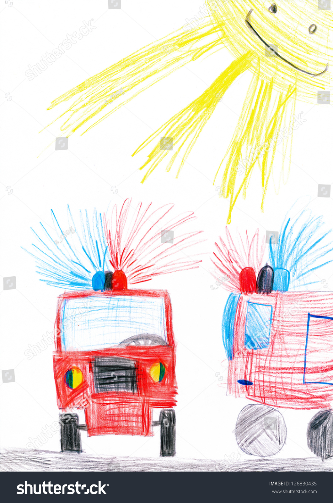
In my previous post I talked about the first theoretic approach mentioned in my book.  The first approach was behaviorism.  Behaviorism is an extreme side of a more hands on method.  However, the one I will talk about today is a psychoanalytical method.  These two often are used together and when looked at separately they are extreme opposites.  Where behaviorism approaches physical learning and turns a cheek to emotions, the psychoanalytical method is, to quote my text, "undertaken as individual therapy over time." (Cullen, 14).  Psychoanalysis emphasizes the embrace of feelings and often includes many hours with a therapist or talking over the subjects thoughts and emotions.  To demonstrate this I talked to one of the children I worked with about a dream they had had recently.  We talked it through and I was able to understand better that using drawings or pictures are helpful in demonstrating one's emotions.  Below is a picture of an example of a child's drawing that was similar to the one we had made together.  This book, Child Psychology by Dr. Kairen Cullen, is extremely insightful and I have definitely learned a great deal. Do you interact with people/children in a more psychoanalytical or behavioristic way?
Taken from http://image.shutterstock.com/z/stock-photo-fire-truck-child-s-drawing-126830435.jpg 

Works Cited
CULLEN, KAIREN. INTRODUCING CHILD PSYCHOLOGY: a Practical Guide. ICON BOOKS LTD, 2018. 

Eyeshadow look: Go for gold

      My 3rd look I created from the Lauren Luke Looks by Lauren Luke is the "go for gold" look. This look is fairly simple.

The thing that was tricky about this look is the wing that was in the look. As you can see in the the picture she has winged her eyeliner and I chose to do the wing. It wasn't to hard to do but my wings(on both eyes) turned out a little different but it wasn't to much of a difference. Mastering a wing eyeliner definitely is hard, but it isn't impossible to accomplish.
For this look I used:
  • Revlon Photo ready foundation 
  • The falsies volume mascara 
  • The 24K Nudes 
  • e.l.f eyeliner pen   
  • e.l.f eyeshadow brush
  • e.l.f blending brush 


The 1st thing I did was put my Revlon photo ready foundation all over my eyelids to make my eyelids 1 color.

Next I put the gold color all over my lid, in the Lauren Luke Looks book she says to use a "Yellow- Gold eyeshadow"(Luke 119). Make sure to put this gold all over your eyelids and blend(in the picture my eyeshadow was not blended, but I do blend it after I just didn't take an after picture)
                                                                                                                
       Next, on the brow bone I put a silvery white color. In the Lauren Luke Looks she says to use a "white eyeshadow"(Luke 120) and that was the closest color I had to white, it still turned out good though (In this picture you can see the gold eyeshadow is blended). Make sure to not put a lot and also blend out the color so it won't look like a blob of (in my case) silvery white eyeshadow.


      Now for the tricky part... winged eyeliner.  "Start in the middle upper eyelid and draw a very fine line to the outer corner, giving a little flick at the end."(Luke 120). Since this winged liner didn't really have "structure" to it wasn't as hard as it would be if the wing had more "structure".
 
  
       After I put the same gold eyeshadow to my lower lash line. In the book she uses a "Honey- gold eyeliner"(Luke 122) to the lower lash line instead of gold eyeshadow.
       Next I put on mascara.
In the book she says to "Apply one layer, wait for 10-20 seconds, apply another layer- and watch your lashes stand up"(Luke 122), and I did that and that made my eyelashes appear more longer.
 This is how the look turned out.


          This is a look that doesn't take a long time(minus the eyeliner. Unless you mastered the art of winged eyeliner). I got to practice my wing eyeliner my right eye was fine but my left need a little work. Do you know how to do wing eyeliner? If you do, how long did it take for you to "master" it?

Lifting Day 3

Warm ups are important to lifting because it gives you muscles more movement and makes them more flexible all while allowing your body to be strained for longer periods of time with less chance for injury. My book also corresponds to Joey’s first blog stating that muscles typically start off cold before and need time to warm them up, which is the intention of warm ups. Warm ups can help carry oxygen to your lungs. “Muscles also rely on oxygen to give them energy to work” (Susan Saliba 25). Another part of warm ups is that “Both breathing, and heart-rate are increased” (Saliba 25). Some exercises to help loosen muscles are lunges, running or shaking your body. Warm ups to help be more flexible include seated hamstring stretch, quadriceps stretch, and groin stretch. Some general rules for stretching is that “If stretching is performed improperly, it will do more harm than good” (Saliba 28). Some ways to avoid improper stretching is to deeply breath all the way throughout, stop after feeling sharpening pain, relax into a stretch and don’t jerk your body for a deeper stretch. I typically focus on exercises that increases my heart-rate.

What are the type of stretches or warm ups do you find help you become looser or have helped you feel more flexible? Have you ever done one of the non-commended ways of stretching so far? Do you do them now? Do you do specific warm ups for a specific sport?


Works Cited
Saliba, Susan. The Basics of Weight Training. Weight Training, Mason Crest

     Publisher, pp. 1-64

Creative Drawing: Landscape and Perspective

David Phan
Drawing: The Only Drawing Book You'll Ever Need to Be the Artist You've Always Wanted to Be by Kathryn Temple

In order to be able to draw, you'll need to know where you're looking from, or your perspective. In Kathryn Temple's book, Drawing: The Only Drawing Book You'll Ever Need to Be the Artist You've Always Wanted to Be, Temple talks about different perspectives and their purposes. The one I'd like to highlight here is landscape perspectives. Temples delves into the process by stating, "I used these tricks of what's called atmospheric perspective to create the illusion of open space: Things get fuzzier the farther away they are; Things tend to appear lighter in value the farther away they are; Things appear to get smaller the farther away they are; Things appear closer together the farther away they are" (Temple 74). These four rules of landscape drawing allow the piece to show where everything is exactly, and allows you to judge the distance between each object in your drawing.

In my drawing, I've decided not to use a picture this time. Instead, I'll use what I know of my own surroundings (living in Washington means there's plenty of trees to look at!) and Temple's advice on landscape drawing to create an image of a meadow with a forest and mountain backdrop. I decided to contrast the image with a wild fire as well to make it more interesting. Here, you'll see I used the landscape techniques by blurring the background, defining the foreground, and shrinking the backdrop. I also used the shadowing and realism techniques from before to give it a final touch.

Do the landscape techniques really seem to allow you to judge different distances in the drawings? How do you think the blending of shadowing and landscape techniques helps give the drawing better depth?


Works Cited
Temple, Kathryn. Drawing: the Only Drawing Book You'll Ever Need to Be the Artist You've Always Wanted to Be. Sterling Children's Book, 2014.

Four point perspective: is it practical? (Concept Drawing)

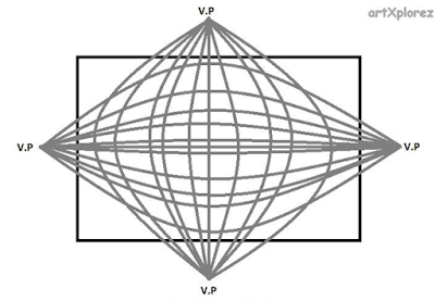
            After doing some more research on the topic of four-point perspective, I became intrigued with the style that it created when drawing. I then experimented with drawing it [see left] to develop a better understanding of how it is constructed. 


           Why draw in four-point perspective? four point perspective is a more practical way to show how a person sees the real world, for example in a landscape photograph you can see that everything is slightly curved, and the horizon is not perfectly straight, as this picture of the Las Vegas strip shows:
Image result for las vegas strip panorama
you can see the street on the bottom of the picture curves around similar to the drawing
          To draw a four point perspective drawing, the first step would be to make a grid. Unlike in one, two, and three point perspective drawings, the lines that converge towards the points are actually curved, creating a grid that may seem uneven but is actually not. Then draw a set of general shapes following the grid lines, then extend lines off of the end of the shape facing towards the adjacent hemisphere of the grid on the right, rotating the paper to put the shape in the top left hemisphere. Then close off the extension lines to define the shape with a set of lines following the original shape pointing towards the bottom point. Another way to explain it is to diverge the lines off the edge to the opposing two points outside of the hemisphere that the shape is in. Apply the same logic to shapes crossing over multiple hemispheres but treat it like two different shapes for the top and bottom, making the shapes have a "fat" look to them, bulging in the middle.
         According to Scott Robertson, "One and two point perspective grids are really simplifications of perspective drawing that have a lot of limitations and their own distortion problems... The entire production team also understands that these simplified grids are not exactly true to  life but rather a kind of designer shorthand in creating the illusion of 3D perspective space on a flat surface" (Robertson 63). This quote explains that a perfectly straight grid is just a simple way to put the world, which is how video game designers show the world, as a more realistic curved viewpoint would be too hard to animate. But drawing through this viewpoint is more practical, a way to take drawings to a new level of realistic representation, inspiring me to draw in this new way.

Question: Did you know anything about four point perspective before? How does this change your viewpoint on drawing?

Drawing can help you in a time of need

Drawing can help you in a time of need

December 31, 2017

     Some people draw to help deal with problems they have in life and that's what i'm here to talk about. Drawing is a way to get your mind off of things, there are unlimited possibilities on what you can draw and ways you can draw it. "Around the age four or five, children being to use drawings to tell stories and to work out problems using small or gross adjustments of the basic forms to express their intended meanings." (Edwards 66) Now this may seem a little bit advanced for a child to know but it's because they just don't know the concept and meaning behind what they are doing even if they do it.
     An example of solving and coping with problems using drawings is about a kid with family problems. This kid was struggling with his sister because she would be a dominant figure everyday and make his life miserable. He then decided to draw his family and his sister being the scary monster to represent the fear she brings. (Edwards 67)

That's all about coping with real life problems, my next question is have you guys ever drawn in bad times to just get your mind off of things?

JavaScript: Style

One of the most important things to remember when writing code is style. Style, in comparison to the real world is simply making the program better and easier to read. Although it can be a small part in the code and how it executes, it makes a huge difference in how the programmer/computer can read and interpret it. There can be many types of styles depending on the programmer, with no true "correct" form. Learning how to properly style your code can be extremely confusing and difficult, but is necessary for successful coding.

Because I am new to programming, this can be one of the most difficult things for me to master and  learn. I often made minute mistakes that cost me quite a bit of time. "Code that appears to mean one thing but actually means another is likely to cause bugs" (Crockford 96). I practiced on SoloLearn and tried to find and fix some of my errors, and see if any of them had a "hidden function" that would interfere with the function I wanted it to run.


Original Code with error
Error code's real output
While searching for errors, I found one of my errors, as the original code on the right was programmed incorrectly, and resulted in the one on the left. It was because I put the brace symbol "}" in the wrong spot, causing the program to misunderstand what you were writing. This can often be confusing, because in JavaScript, the way you write code is extremely important, and even a seemingly insignificant mishap can detract from the code's function.

Style is nearly everything you write in the program to make it easier to read, which includes comments. Code in the form of comments, or lines with two backslashes in front can give readers more information on the program, such as what the programmer was thinking or leaving important to-do messages (Crockford 96). In my code, I often use comments such as these to help me remember what I did with the code, or its functions. As a new programmer, it can be confusing for me to look back and remember what I was thinking/doing. These have helped me greatly, since I am busy with things other than coding, and I spread my programming time over a large period to prioritize other tasks. I often forget my thoughts during the coding session, especially after being away for long periods of time. Comments, however, refresh my memory, so using them can set me on track to finish my code.
Creating a comment in green

Comments do not affect the code, but they can be part of the backbone of the code, since they are there solely for the purpose of clarification. Making effective and useful comments can greatly improve how easily the program can be understood by programmers, and thus play a large part in the code's style.

Through my trial and error, I have learned more about how to style my code to make it as easy as possible for the machine to understand what I am inputting. It may not seem important at first, but as you start creating more advanced programs, it becomes clear how crucial it is to have proper style and formatting.

Question: How does style play a role in your life? Does the way you perform your tasks or work affect its outcome? 
Works Cited:
Crockford, Douglas. JavaScript: The Good Parts. O'Reilly Media, Inc., 2008.


Drawing on the Right Side of the Brain

December 31, 2017

Drawing with your imagination

     Drawing is a way to pass your free time, and is usually something you would do as a kid. It has some benefits like improving your mental health. I used to draw all the time as a kid because it was just something to do when I was bored. I was never good at drawing unless i was tracing over an image so I want to improve and advance my skills.

     At the very start I never really thought too in depth on the process of drawing it was more of a sketch it and be done. This book has told me that drawing comes from your ability to "see". Which means your creativity and imagination. "To put it more precisely, most people never learn to see well enough to draw." There are certain techniques and tips you can use to really improve your abilities, drawing comes from your own creativity and how you want to shape and draw objects.

     First you want to just find your style, such as drawing with a serious style, comedic, or simple stick figure like drawings. The author writes about how the key is to keep drawing the same thing over and over again, and each time it should be improved (7).

This is my first demonstration, and a question i have for you is are you a good enough drawer to use only your imagination?


drawing and inking animal anatomy: horse face, front leg, and ear


    Over this part of the break I continued to read into chapter 3, which is about horses. "The horse is considered by many to be a living work of art. It combines grace and power in one beautiful package"(Amberlyn72).

Simple geometric outline:
    The title of this one gives away what this section of the chapter is about, but it is just a rough geometric out line of what the head is going to look like by using simple shapes, such as, triangles, squares, circles, and ovals. "Note how the tear duct roughly aligns with the bottom line of the mouth/jaw"(Amberlyn74). 
Rough geometric outline 

Front leg:
    For this section I only drew the front leg just to get the essential understandings. "The horse essentially has one very long "finger" and is walking on its fingernails"(Amberlyn81)" This step by step picture helped me a lot when drawing the front leg and hove. 

Front leg 

Ear:
    The ear of a horse is in a teardrop like shape. "Horses can move their ears to listen to sounds or express emotions" (Amberlyn77). The ear can move in different directions based on its emotions or the situation that it is in.

Basic shape of ear 

Mine
What do you think about my drawing?
Was this information helpful?
What can I improve on?
Any questions?


Simply Glamorous: Correct and conceal

Hi, welcome back, this is Ashley and today I am focusing on the correcting and concealing part of ones make-up routine. Concealer for me has always been my go-to product. Most of the time I just put it all over my face how ever I feel like it with no structure, but after reading Gary Cockerills book Simply Glamorous, I now feel better about the kind of concealer I am applying and where I am applying that concealer. My skin also has a lot of discoloration and redness to it, so I find these correcting tips that I will discuss throughout this blog post, along with the concealer tips, very helpful:) I read in Cockerills book a question he is often asked, and that is "if theirs a difference between color correctors and concealers, and whether color correctors are really necessary," (Cockerill 30), his answer was "theirs a big difference and, yes, by incorporating color correctors into your make-up routine, you can not only cover up an area but neutralize it too, and ensure your make-up holds its color and disguises any flaws" (Cockerill 30). Although I like to incorporate these things into my make-up routine, I have always wondered those questions, and its very nice to know exactly why adding these two things, and applying them correctly is so important and useful.

Correct

There are various colors that you can apply to your face, all with different purposes. My personal favorite is green because it conceals redness, and is good for covering pimples according to Cockerill, and those two things are very present on my face which brings me to like the green color corrector very much. Along with green there is also lilac, " a pick-me up that brightens the skin and counteracts dull, sallow tones" (Cockerill 30). Something I like to use and i feel it does better then the lilac color especially for my skin is using a highlight (bright shimmery color) right above my cheek bone, and on the tip of my nose. Another color used for correcting is a peachy pink color, which brightens the area under your eyes (Cockerill 30). This will help with those bags we all get from stress or lack of sleep, so I find this color very useful.
Here you can see I chose to just apply the green corrector. I applied it to the parts that Cockerill suggested in the book (Cockerill 30), see the picture below that shows where Cockerill applies these color correctors. These are the main parts that my skin naturally has redness. 
(Cockerill 30) Here is the image that Cockerill included in his book. Here you can see where the green, lilac, and peachy pink colors were added to the face.
After I applied this color, I blended it together will a make-up brush then used my fingers to help soften down the edges so the green color wasn't so obvious.
Then you will want to go in and add concealer, like talked about below.

Conceal

The concealers I have are, stick concealers and liquid ones. Although I always do my make-up I have never really known which concealer should be used where. Reading this book has really given me insight to that, and I hope you take these tips to be useful, and I hope that my experience with them is beneficial. Cockerill states that stick concealers has a thicker consistency, and is good for blemishes and easy to apply directly on the area that needs it (Cockerill 31). This is very useful to know because I used to apply stick concealers under my eye, but now I know I shouldn't do that. Cockerill also states that liquid concealers is a multipurpose concealer and is easy to blend and apply, and gives a nice light coverage (Cockerill 31). I love liquid concealer because of how light and easy it is to apply.
Here is all the places I added concealer. I decided to go with the liquid concealer under neath my eyes, and then the stick concealer on all my blemishes.
After you add the concealer you will want to blend. I decided to not use any foundation in this look, so I just finished blending everything together, and finished the look off my adding a loose powder and mascara. 

Color correcting and applying concealer are very useful tricks to know how to apply properly when applying make-up, and I hope you can use my opinions I talked about, and Cockerill's professional opinion to create your best look possible. 

Have you ever experimented with color correcting? What kind of concealer out of the two I talked about (stick or liquid) do you prefer?


Cockerill, Gary, et al. Simply Glamorous: Make-up Transformations to Make You Look & Feel Fabolous. Jacqui Small, 2015.